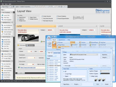
New layout structure inheritance allows all layout elements to be transferred to descendants of the layout control.
Julho 6, 2011
Lançamentos em destaque
ExpressQuantumPack is a suite of VCL components that includes ExpressQuantumGrid Suite - for adding grid, treelist, and data editor capability, ExpressPrinting System - allows Delphi and C++Builder developers to bring their UI to the printed page.ExpressLayout Control - form layout customization control allowing you to easily arrange controls and make them automatically resizeable with the container. ExpressSkins Library - application-wide skinning library providing cutting-edge look and feel options inspired by popular software products as well as unique skins designed by DevExpress.
Updates in v2011 vol 1
ExpressQuantumGrid Suite updates
- Layout View - In Layout View, data records are displayed as cards. This new View extends the Card View, in that it gives end-users the ability to visually remodel card structure via drag-and-drop operations. In customization mode, end-users can manually rearrange card rows within cards. You can combine card rows into layout groups. You can span card rows over neighboring rows and layout groups. You can also add auxiliary layout elements (empty regions, separators and labels) to the card from the Customization Form.
- New Chart View Options - This release includes enhanced Chart Views and new Chart View options: Area Diagram, Stacked Area Diagram, Line Diagram, Stacked Bars/Columns, Full-Stacked, Bars/Columns, Side-by-Side Stacked Bars/Columns and Side-by-Side Full-Stacked Bars/Columns
- Chart diagram features - Missing values can be displayed as either empty points or zero values. It includes transparency support for filled diagrams (requires the Microsoft GDI+ Library) and antialiasing. For a better-looking chart, you can enable a smoothing option (requires the Microsoft GDI+ Library)
- Locked View Image - For time-consuming operations, such as bulk data updates, the grid can optionally display a "Locked View" image informing end-users that the View is awaiting updates.
- New "Group By" Panel Layout - The "Group By" panel provides two options to display dropped column headers. The first uses a standard layout, in which headers are shown hierarchically. In the new layout, column headers are aligned horizontally, taking up less space vertically.
- Grid Navigator Enhancements - The Grid Navigator is equipped with an "Info Panel" section. This panel displays information about the total number of records and the focused record's position within the recordset.
- Multi-Line Editor Autosizing - In-place editor sizing. In the edited data cell, an editor is sized vertically to populate entered content. When the end-user has completed data editing, the height of the edited row is automatically changed to fit the new data.
- Alternate Hints for Column Headers - As an alternative to the default hint, you can provide any explanatory text specific to the column within the hint window. This hint can be displayed even when the column caption is not clipped.
- Data Export Enhancements - The QuantumGrid supports export to the XLSX (Microsoft Excel 2007 and higher). When using new export routines, image format in the final output is the same as that defined in the grid.
- Filtering Enhancements - Incremental filtering mode for the Filter Row has been extended with a “deferred update” option. If this option is enabled, the View will be updated after a specified delay. This behavior allows an end-user to make several changes within the Filter Row (to create a more complete filter) before applying the entered filter criteria. When filtering large amounts of data, the deferred update option will reduce the amount of work being done and the number of filter requests generated compared to filtering the data with each keystroke.
ExpressLayout Control updates
- Layout Structure Inheritance - All layout elements can now be transferred to descendants of the layout control.
- New Layout Settings - New options for tabbed groups. With these settings, you can customize a tabbed group’s appearance in various ways. Group buttons can be positioned either on the group's left or right side. You can specify padding for each side of a layout element. Once specified, padding can be quickly triggered by changing individual padding options.
- Automatic tree expansion when dragging - In the Customization Form, a collapsed layout group is automatically expanded if a dragged layout element is positioned over the group's caption.
- Automatic tab switching when dragging - When the Customization Form is in tabbed View, dragging a layout element over the Layout Tree View or Available Items tabs automatically switches panes.
- Lock icon for layout groups - To ensure that end-users can see that a group is locked, the layout control displays a lock icon above the group's icon in the Customization Form.
About DevExpress (Developer Express)
Developer Express is a software development company based in the United States. It produces coding assistance tools and components for Delphi, C++ Builder and Microsoft Visual Studio developers. The major part of its product line is VCL, .NET WinForms and ASP.NET components that replicate the UI of Microsoft Windows and Microsoft Office applications. Developer Express has won many industry awards for its products.
Layout View and Print demos included in ExpressQuantumPack.
Adicione funcionalidade extensas de grade, impressão, layout e skinning aos seus aplicativos Delphi e C++Builder com este conjunto de componentes.
Tem alguma pergunta?
Chat ao vivo com nossos especialistas de licenciamento de DevExpress.

Distribuidor oficial desde 2001
