官方供应商
我们作为官方授权经销商,直接提供超过200家开发厂家所发行超过1000个的产品授权给您。
查看我们的所有品牌。
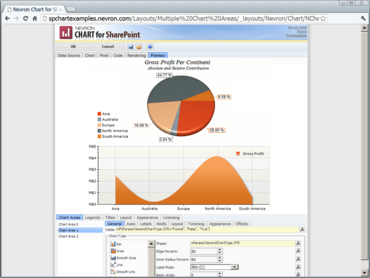
Nevron Chart for SharePoint is an advanced chart web part, which delivers a complete set of 2D and 3D charting types, highly customizable axes, advanced data analysis features, tight data integration and visual effects to your SharePoint sites. It combines the Nevron Charting engine for ASP.NET together with the elegant Nevron Pivot Data Aggregation engine. This allows Nevron Chart for SharePoint users to create complex pivot charts visually and directly in the SharePoint environment.
Founded in 1998, Nevron is a global leader in component based data visualization technology for a diverse range of Microsoft centric platforms. Built with usability and enterprise level features in mind, their components deliver advanced charting, digital dashboards and diagrams. Today Nevron components are used by many Fortune 500 companies and thousands of developers and IT professionals worldwide.

在 SharePoint 中创建数字仪表板和报告。
透过Live Chat与我们的Nevron 专家联络!