Telerik DevCraft UI
Eine schlanke Oberfläche und Werkzeuge für .NET- und JavaScript-Technologien.
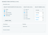
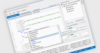
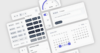
60+ ASP.NET Core Components - Telerik DevCraft UI enthält eine breite Palette von ASP.NET-Steuerelementen, darunter Datenmanagement, Datenvisualisierung, Interaktivität, Geovisualisierung, Editoren, Layout und Navigation.


 (5)
(5)

 (2)
(2)
 (1)
(1)

 (3)
(3)