
ComponentOne FlexGrid for WinForms
Create user-friendly interfaces that display, edit, format, organize, summarize, and print tabular data.
Published by MESCIUS (formerly GrapeCity)
Distributed by ComponentSource since 1996
Create user-friendly interfaces that display, edit, format, organize, summarize, and print tabular data.
Published by MESCIUS (formerly GrapeCity)
Distributed by ComponentSource since 1996

ComponentOne FlexGrid for WinForms is no longer available individually. It can be bought as part of ComponentOne Studio Enterprise and ComponentOne Studio for WinForms. Existing customers can renew ComponentOne Studio for WinForms or upgrade to ComponentOne Studio Enterprise.
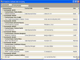
ComponentOne FlexGrid for WinForms incorporates the latest in data-binding technology, ADO.NET, to integrate seamlessly with the Microsoft .NET Framework. New features include: hierarchical styles, calculated columns, a simpler and more powerful object model, enhanced cell editing (masks, buttons, etc.), better painting (such as scalable images and transparency), object-oriented design and design-time support. ComponentOne FlexGrid for WinForms also includes FlexGridClassic, a wrapper class that provides an object model with the ActiveX version of the control. ComponentOne FlexGrid for WinForms is Visual Studio 2010 compatible.


Image 1 / 11
ComponentOne FlexGrid for WinForms is the .NET version of the ActiveX control, VSFlexGrid Pro. ComponentOne have completely rewritten VSFlexGrid Pro to take advantage of the infrastructure provided by .NET so you can maximize your development productivity. ComponentOne FlexGrid for WinForms is now VS2010, .NET framework 4.0 compatible.
ComponentOne FlexGrid for WinForms incorporates the latest in data-binding technology, ADO.NET, to integrate seamlessly with the Microsoft .NET Framework. As a...


Live Chat with our MESCIUS (formerly GrapeCity) licensing specialists now.


Tel: (888) 850 9911
Fax: +1 770 250 6199


