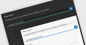
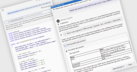
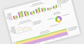
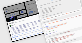
Bitte beachten Sie, diese Produktinformation ist nicht in deutscher Sprache verfügbar.
With Telerik RadControls for WinForms, you get the visual attractiveness of WPF while still using the familiar Windows Forms controls. Telerik RadControls for WinForms provide: (a) advanced GDI+ rendering techniques: rotation, scaling, animations, transparencies; (b) run natively on all .NET 2.0 platforms (Windows XP, Windows Server 2003, Windows Vista, etc.); (c) excellent WinForms-grade performance; (d) no need to invest in Vista-class hardware; (e) ideal choice for enterprise business systems (CAB support is provided); (f) three productivity tools are also included: Control Spy, Visual Style Builder and Shape Editor. The Subscription License comes with a Gold Support Package (up to 24h response time), full C# source code, redistribution rights and free updates for the latest products for 1 year. The tools work without license keys and can be freely deployed on an unlimited number of development, testing and production servers. Hundreds of code samples and comprehensive documentation are provided to accelerate your learning.
Durchschnittliche Rezension:
basierend auf 3 Rezensionen.
Unsere regulären Preise werden nachstehend angezeigt. Bitte melden Sie sich an um Ihre ermäßigten Preise zu sehen.
RadControls for WinForms Q3 2008
| In den Einkaufswagen |
₩ 1,040,200 |
1 Developer License Hersteller Art-Nr. 63389533056 |
|
Download (106.9 MB) |
| In den Einkaufswagen |
₩ 1,300,600 |
1 Developer License with Subscription and Source Code Hersteller Art-Nr. 99407663599 |
|
Download (143.4 MB) |
| In den Einkaufswagen |
₩ 988,200 |
3-4 Developer License - price per license |
|
Download (106.9 MB) |
| In den Einkaufswagen |
₩ 1,235,600 |
3-4 Developer License - price per license with Subscription and Source Code |
|
Download (143.4 MB) |
| In den Einkaufswagen |
₩ 933,300 |
5-9 Developer License - price per license |
|
Download (106.9 MB) |
| In den Einkaufswagen |
₩ 1,166,900 |
5-9 Developer License - price per license with Subscription and Source Code |
|
Download (143.4 MB) |
| In den Einkaufswagen |
₩ 878,400 |
10-15 Developer License - price per license |
|
Download (106.9 MB) |
| In den Einkaufswagen |
₩ 1,133,000 |
10-15 Developer License - price per license with Subscription and Source Code |
|
Download (143.4 MB) |
| In den Einkaufswagen |
₩ 823,500 |
16 or more Developer License - price per license |
|
Download (106.9 MB) |
| In den Einkaufswagen |
₩ 1,029,600 |
16 or more Developer License - price per license with Subscription and Source Code |
|
Download (143.4 MB) |
RadControls for WinForms - Renewal Pre Expiry
| In den Einkaufswagen |
₩ 685,700 |
1 Developer License - Subscription (Pre Expiry) Renewal (free product updates, new product releases and gold support for 1 year) Hersteller Art-Nr. 0950718779 |
Prüfen |
Download (28 KB) |
| In den Einkaufswagen |
₩ 636,700 |
3-4 Developer License - Subscription (Pre Expiry) Renewal (free product updates, new product releases and gold support for 1 year) - price per license |
Prüfen |
Download (28 KB) |
| In den Einkaufswagen |
₩ 601,300 |
5-9 Developer License - Subscription (Pre Expiry) Renewal (free product updates, new product releases and gold support for 1 year) - price per license |
Prüfen |
Download (28 KB) |
| In den Einkaufswagen |
₩ 565,900 |
10-15 Developer License - Subscription (Pre Expiry) Renewal (free product updates, new product releases and gold support for 1 year) - price per license |
Prüfen |
Download (28 KB) |
| In den Einkaufswagen |
₩ 530,500 |
16 or more Developer License - Subscription (Pre Expiry) Renewal (free product updates, new product releases and gold support for 1 year) - price per license |
Prüfen |
Download (28 KB) |
RadControls for WinForms - Renewal Post Expiry
| In den Einkaufswagen |
₩ 891,900 |
1 Developer License - Subscription (Post Expiry) Renewal retains original expiry date (free product updates, new product releases and gold support for 1 year) Hersteller Art-Nr. 35643992358 |
Prüfen |
Download (28 KB) |
| In den Einkaufswagen |
₩ 828,000 |
3-4 Developer License - Subscription (Post Expiry) Renewal retains original expiry date (free product updates, new product releases and gold support for 1 year) - price per license |
Prüfen |
Download (28 KB) |
| In den Einkaufswagen |
₩ 782,000 |
5-9 Developer License - Subscription (Post Expiry) Renewal retains original expiry date (free product updates, new product releases and gold support for 1 year) - price per license |
Prüfen |
Download (28 KB) |
| In den Einkaufswagen |
₩ 736,000 |
10-15 Developer License - Subscription (Post Expiry) Renewal retains original expiry date (free product updates, new product releases and gold support for 1 year) - price per license |
Prüfen |
Download (28 KB) |
| In den Einkaufswagen |
₩ 690,000 |
16 or more Developer License - Subscription (Post Expiry) Renewal retains original expiry date (free product updates, new product releases and gold support for 1 year) - price per license |
Prüfen |
Download (28 KB) |
RadControls for WinForms Q3 2008 - Upgrades
| In den Einkaufswagen |
₩ 685,700 |
1 Developer License - with Subscription and Source Code Upgrade from previous version Hersteller Art-Nr. 30861083100 |
Prüfen |
Download (143.4 MB) |
RadControls for WinForms Q3 2008 - Educational and Non-profit Licenses
Unsere Preise beinhalten einen technischen Support durch ComponentSource und für die meisten herunterladbaren Produkte zusätzlich ein Online-Backup sowie eine kostenlose Aktualisierung auf die neue Version, sofern sie binnen 30 Tagen nach dem Kauf freigegeben werden. Die angezeigten Preise sind zuzüglich aller Steuern. Für mehr Information zu eventuell anfallende Steuern, gehen Sie bitte auf diese Webseite. Alle Verkäufe unterliegen unseren Standardgeschäftsbedingungen und unseren Rückgaberegeln. Treten Sie bitte mit uns in Kontakt , wenn Sie eine Lizenzierungsoption anfordern möchten, die in der obigen Liste nicht aufgeführt ist, einschließlich Mehrplatzlizenzen und ältere Versionen.
Unsere regulären Preise werden oben angezeigt. Bitte melden Sie sich an um Ihre ermäßigten Preise zu sehen.
What’s new in RadControls for WinForms Q3 2008?
New controls and enhancements
RadScheduler - RadScheduler is a scheduling component blending rich Outlook®-style functionality with swift performance, simplified deployment and limitless customization capabilities. It offers all essential features for today’s large enterprise applications:
- Views:
- Day view with Work time display, Visible time customization, Multiple-days, Current time highlighting, All-day appointments, Advanced time rulers
- Week view
- Work week view
- Month View
- Appointment Capabilities - recurrence, status and category support, skinned appointments, unassigned and resourced appointments
- End-User Capabilities - built-in popup menus, context menus and dialogs
- Customization - localization, end-user restrictions, accessible time interval, full custom painting support
RadMessageBox - Another new component in the Q3 2008 release, RadMessageBox delivers a set of modal dialog boxes that can be used to show system messages. The dialogs contain a system icon, a set of buttons, and a brief application-specific message, such as status or error information. The API is very similar to the WinForms MessageBox API. The supported dialogs are:
- Confirm box
- Prompt dialog
- Alert dialog
Rich-Text support on framework - RadControls for WinForms Q3 2008 introduces an advanced text styling mechanism, which can be applied to all Telerik products, because it enhances the smallest element in the Telerik Presentation Framework - the text primitive. The new rich text formatting mechanism uses plain HTML tags to display formatted text such as font style, font color, font size options and simple layouts.
RadRibbonForm - A new form specially designed to resemble the MS Office 2007 UI. It is based on RadForm, and contains RadTitleBar, RadRibbonBara, and RadStatusBar.
New Item Templates in Visual Studio
- RadForm
- ShapedForm
- RadRibbonForm
- RadAboutBox
Impoovements in Existing Controls
Themes (all controls)
- Performance optimizations in the theme generation and loading from generated code (currently for the Default theme only)
- Themes Color Blending - ability to style entire applications with just 3 lines of code. All you need to do is select the new theme’s color and the new scheme is applied to all Telerik WinForms controls that you are using in your application.
- Improved the RadMenu themes
- Improved the RadSplitButton and RadDropDownButton themes
Screen Tips (all controls) - Enhanced support for Office 2007-like screen tips.
RadGridView
- New grid views - Multi-row headers (column-header grouping), advanced row layout, such as header and data cells spanning to multiple rows/columns. The flexible layout for displaying data is achieved either through simple HTML or through a dedicated ColumnGroupsView, both enabling column grouping and row layout customization. The three supported views are:
- TableView - this is the default view;
- ColumnGroupsView - enables columns grouping and customizing the row layout;
- HtmlView - the row layout is specified exactly like an HTML table.
- Design-time improvements - improved grid property builder and design-time behavior (for both RadGrdiView and RadMultiColumnComboBox)
- Events and API added for custom sorting, filtering, grouping
- Improvements in the Save/Load layout mechanism
- Improvements in the API for creating custom Rows/Cells
- Added support for header icons
- Cells now support display of both text and image, with ImageTextRelation options
- Support for Office 2007-like Screen Tips
RadForm
- Optimized double buffering, which increses loading performance and minimizes flickering with many controls in the form
- Added ability to customizing the non-client area (borders, colors, etc)
RadTreeView
- SelectedNodes now inherits ObservableCollection, which features a richer API.
Telerik.WinControls.ComponentXmlSerializer
- Added API for serializing Windows Forms Components’ properties from/to XML
RadDock
- Exposed the Auto-hide Panel API through DockingManager
What's included in Telerik RadControls for WinForms:
RadCombobox
- Multiline text and styling support - RadCombobox supports two label types in its items - a title and a description. When in sort or autocomplete mode, the combobox uses the title label only, making programming and operation easier. You can style these labels separately for better control over RadCombobox' s visual appearance. Multiline text is supported as well - instead of truncating long text, you can have it on several lines
- Versatile binding mechanism - RadCombobox fully supports binding to collections, tables, datasets, and custom objects. Three properties control data binding:
- The DataSource property specifies the ultimate source of the data to be bound
- The DisplayMember property specifies the particular data to be displayed in the RadCombobox.
- The ValueMember property specifies the particular data to be returned as the value of the RadCombobox
- Flexible autocomplete options - RadCombobox has full autocomplete support - as soon as the user starts typing, the combobox selects or fills-in the first matching entry from the list. The different autocomplete modes of RadCombobox are Suggest, Append, SuggestAppend, and Off. They can be set through the AutoCompleteMode property
- Sorted drop-down lists - RadCombobox supports automatic sorting, based on the Sorted property of the control - simply set it Ascending or Descending to sort in the respective order, or deactivate it to restore the initial ordering of the ItemCollection. Sorting may be case-sensitive or case-insensitive. Capital letters are displayed first in the former case
- Rotating list items on double-click - Double-click on the text box in a RadCombobox, and it will pull up the next item from the list. This timesaving feature allows you to quickly advance through a list without seeing all the items
- Keyboard support - RadCombobox delivers convenience with integrated keyboard support. Once the control gets the focus, you can use the arrow keys to navigate through the items
- Editable/Read-only drop-down modes - You decide whether users can enter free-form data or just select from the entries in the dropdown list. A single property setting switches editing on or off, making the text box portion of the control editable or read-only
- Images in the drop-down list - With the RadCombobox, you can assign an image to each item in the drop-down list. Images can be placed above, below, beside, or behind the text. You can use them as icons, headings, or backgrounds
RadDock
- Full-featured VS2005-like docking system - RadDock ensures you have complete support of the latest user interface standards. The docking system has full drag-and-drop support including the docking compass and docking hints for visual feedback. When a ToolWindow is about to be docked to a docking zone, the zone is highlighted to show where the object will be placed. The way a zone is highlighted can be customized
- Centralized DockingManager -The DockingManager control provides a container that holds dockable windows. This container can fill the entire client area of a Windows Form, or can be limited to any rectangular area you choose to manage. You can mix a docking implementation with traditional Windows Forms or RadControls on the same form
- ToolWindow control and behavior - The ToolWindow control provides a container that can be docked within the DockingManager. You can place other controls (either RadControls or standard Windows Forms controls) within a ToolWindow.
- You can specify whether the ToolWindow object is floating, docked, nested, autohidden, pinned, or tabbed to the current position on the form. In accordance with the specified behavior, the state button of the corresponding ToolWindow will show the possible state choices. You can also get increased ToolWindow functionality with horizontal and vertical splits.
- Docking custom UserControls - RadDock enables you to create your own user controls to dock. The ToolWindow control is the container that can be docked within the DockingManager, and you can place both RadControls or standard Windows Forms controls within the ToolWindow. The ToolWindow, itself, is derived from the standard UserControl class, so you can use the Visual Studio designer to visually develop the contents of your ToolWindows. At run time, it’s simple to instantiate as many dockable windows as you need
- Interactive design-time layout management - The Docking Designer gives you fully interactive design-time control over the number, position, and properties of ToolWindows within a DockingManager. You can visually design the initial size and position of ToolWindows on your form without writing a single line of code. ToolWindow layouts can be saved to XML files for easy loading at run time
- Show content while dragging - The content of a dockable object is rendered semitransparent while it is being dragged for better visibility
- Keyboard navigation support - You can navigate between ToolWindows in a Windows-like fashion by pressing Ctrl+Tab. A notification window will open with all available windows. You can use either Ctrl+Tab or the mouse to select the ToolWindow you need to navigate to, even if is hidden. Additionally, you can use the arrow keys to control the horizontal and vertical splits.
- Save/Load layout state - RadDock supports serialization and deserialization. All changes made to the dynamic page layouts can be stored in an XML file and reloaded when needed. This is an excellent way for portal customization and preservation of user layout settings
RadMenustrip
- Multiline text and image support - RadMenustrip supports multiline text in its items - instead of truncating long text, it is displayed on several lines. This is achieved through a label which RadMenustrip uses for its text field. Images and text can be displayed on menuitems as well. You can customize the image-text relation by setting the TextImageRelation property. Possible values are: Overlay, ImageAboveText, TextAboveImage, TextBeforeImage, and ImageBeforeText
- Support for nested controls - You can nest any RadControl or custom element within RadMenustrip. This feature gives you enormous flexibility in building functionality into applications and allows you to create complex custom user interfaces featuring text boxes, combo boxes, or other custom elements within the menu area
- Full keyboard support - RadMenustrip delivers convenience with full support for Shortcuts, Accelerator Keys, and Arrow-key navigation. RadMenustrip can be assigned shortcuts through the Shortcuts component - the base of the whole shortcuts system implemented for the descendants of RadControl and RadItem. The component serializes InputBinding objects as a collection. Every InputBinding object binds keyboard shortcut used for activation, a valid Command instance, and a command context which is the object that will be the target of the command's execution
- Checked/Unchecked/Disabled menu items - Using the API of RadMenustrip you can have Checked, Unchecked, Disabled, or regular menu items
- Horizontal or Vertical menustrip orientation - You can specify the way the RadMenustrip is oriented on the page, i.e. Horizontal (default) or Vertical. When Orientation is set, its value determines the flow of the root group as well
- Vertical/Horizontal/Arbitrary text orientation - Text within each main item can be angled to fit your particular case, regardless of the orientation. You can have it horizontal, vertical or at an arbitrary angle
- Add/Remove items at runtime - With RadMenustrip you can Add and Remove items programmatically at run time. When adding new Items, they are appended to the existing items in the same menu using the Add(Item) method. Removing items hides them from the menu
RadPanelbar
- Support for nested controls - You can nest any RadControl or custom element within RadPanelbar. This feature gives you enormous flexibility in building functionality into applications and allows you to create complex custom user interfaces featuring text boxes, combo boxes, or other custom elements within the panel area. If you nest another panelbar, you get hierarchal appearance
- Multi-level hierarchical nesting - You can easily build multilevel panelbars with RadPanelbar. Simply put another panelbar in any panel to create a hierarchical panelbar
- Support for Themes - Themes allow for the separation of a control's look from its functionality. Themes can be easily build with the Visual Style Builder. As a result, developers will be able to completely change the look of a windows forms application in an easy declarative manner
- Design-time support - RadPanelbar features full VS2005 design-time support for complete control over the component's functionality
- ListBar, ExplorerBar, Outlook or VS2005 ToolBox modes
- Support for multiple columns - RadPanelbar for WinForms is flexible enough to allow you to organize your navigation in the most convenient manner. You can set the panelbar items in columns to provide menu-like behavior and better organization of your data
- Expanded/Collapsed initial panelbar state - You can specify the initial state of your panelbars. Depending on the design specifics of your application you can have them initially expanded or initially collapsed
- Single expanded option - RadPanelbar can be configured so that only one group is visible at a time. When you click on one group it opens it and collapses the currently open group
RadRibbonbar
- Easily implement MS Office 2007 interfaces - The RadRibbonbar control enables you to build user interfaces similar to the ribbonbar used by Microsoft Office 2007. This feature ensures your applications will have a similar look to the most up-to-date Microsoft applications that users will know. The RadControls suite for WinForms supplies a variety of controls that you can host in the RadRibbonbar including themeable check boxes, split buttons, repeat buttons, drop-down buttons, and more
- Animated collapse/expand of ribbonbar - To save space, you can collapse the RadRibbonbar by double-clicking the selected tab. The entire bottom part disappears, leaving only a single row of tabs across the top
- Support for chunks and button groups - Each RadRibbonbar tab can host one or more chunks. A chunk is a container for the other containers and individual functional elements. Chunks can individually collapse if there is not enough room to display them all. Chunks may contain one or more button groups. A button group is a container that can contain other nested button groups or individual functional elements. Button groups can be oriented horizontally (containing a horizontal row of elements) or vertically (containing a vertical column of elements)
- Collapsing/Expanding tool chunks on resize - When the RibbonBar is being resized, and more specifically when it's getting smaller, it automatically collapses the tool chunks to save space. Respectively when its getting larger it expands the chunks for which there's available space
- Design time support - The RadRibbonbar was built with ease of design in mind. You can build an entire ribbon in the Windows Forms designers by manipulating tabs, chunks, and controls directly, without writing any code. Then customize the appearance with the VisualStyleBuilder to give it the final look and feel for your own application
- Customizable Start Button - The Start Button provides convenient access to the Start Menu of important commands. This button can be customized to fit many needs including to aid in corporate branding
- Quick-Access Menu - The Quick Access Menu above the ribbon tabs can be used for customization or frequently-used commands. This feature is a great productivity boost for users who often need to utilize the same commands in a majority of their work
- Unlimited number of nested controls - With RadRibbonbar, you can organize all of the functionality of your application into a single compact ribbon containing an almost unlimited number of nested controls. The ribbon splits your application’s controls into a natural hierarchy starting with tabs of major functionality. Tabs include chunks, which in turn contain an unlimited number of controls including toolbars, customizable buttons, and combo boxes
RadTabstrip
- Drag and drop support - You can allow users to rearrange tabs at run time via a drag-and-drop. Once dragging begins, the tabstrip will hint where the drop will appear by showing visual pointers in between tabs. You can turn this option off entirely by setting the AllowDragDrop property to false
- Scrolling and Overflow support - If there are more tabs than can be displayed, you can use tab scrolling and overflow management. With tab scrolling, you can use arrow buttons for left and right navigation. Or you can navigate to the needed tab by using the overflow button which lists all available tabs. The buttons can be positioned anywhere around the tabstrip
- Visually customizable tab shape - You can choose from predefined tab shapes matching those used in popular applications such as Microsoft Internet Explorer or Microsoft Visual Studio. If that’s not flexible enough for you, use the built-in Shape Designer to come up with a custom shape using any combination of lines and curves. Shapes can be saved and reused as often as you like. The Shape Designer gives you the extra edge in customizing each tab's appearance by creating curved designs with Bézier curves
- Nesting controls on content panels - You can automatically manage other controls on embedded content panels. Place any control from the RadControls suite or elsewhere on a content panel associated with a RadTabstrip, and it will only be displayed when that tab is active. This is the quick and easy way to build a modern tabbed user interface and gives you flexibility when building applications which require complex UI
- Keyboard support - RadTabstrip delivers convenience with integrated keyboard support. Once the tab gets the focus, you can use the arrow keys or the Tab/Shift+Tab keys to navigate through the tabs
- Various tab positions - With RadTabstrip, tabs can be displayed in horizontal and vertical orientation, either at the top, bottom, left, or right of the content panel. All you need is to set the TabsPosition property to Top, Bottom, Left or Right and the TextOrientation property to Horizontal or Vertical
- Vertical/Horizontal/Arbitrary text orientation - Text within each tab can be angled to fit your particular case, regardless of the tab orientation. You can have it horizontal, vertical or at an arbitrary angle
- Image support - Images and text can be displayed on tabs as well. You cam customize the image-text relation by setting the TextImageRelation property. Possible values are: Overlay, ImageAboveText, TextAboveImage, TextBeforeImage, and ImageBeforeText
- Multiline text support - RadTabstrip supports multiline text in its tabs - instead of truncating long text, it is displayed on several lines. This is achieved through a label which RadTabstrip uses for its text field
RadToolstrip
- Rich Collection of Toolstrip Items - RadToolstrip items are represented as child controls in the structure of the toolstrip and are very easily customized using themes and related properties. Supported button types are:
- Regular buttons
- Toggle buttons
- Dropdown buttons
- Host buttons for nesting controls such as RadCombobox, standard textboxes, split buttons, etc.
- Separators
- Text-only, Image-only, or Mixed buttons - Toolstrips can be moved, rearranged, and resized at run time for easy end-user customization, and styled to match any user interface you desire with the aid of the Presentation Framework. Every button on the toolstrip can be customized independently to either display text, image or both
- Horizontal or Vertical Orientation - You can specify the way the toolbar is oriented on the page, i.e. horizontally or vertically. To determine the orientation of a given toolbar you can use the Orientation property
- Run time customization with drag and drop - In a MS Office-like manner, different instances of RadToolstrips can be moved, docked, and rearranged by the end user at run time to get the interface that best suits his/her working habits
- Dynamic Add/Remove buttons support - RadToolstrip supports adding and removing functionality for its tools, MS Office style, regardless of their type and position. Just click on the "Add or Remove Buttons" dropdown to personalize the toolbar
RadUielements
- Customizable buttons and checkboxes - The RadXControls for WinForms suite contains several button controls that will enable you to create advanced functionality for your WinForms applications. They provide all of the features of the basic WinForms button, and also allows you to take advantage of the features of RadControls, such as styles and themes, and handling images and text.
- RadButton is simple button control which replaces the standard WinForms Button, but gives you full control over the visual appearance. Supports themes, images, text, and backgrounds
- The RadCheckbox replaces the WinForms CheckBox control and adds robust data binding, state management, and design options
- The RadTogglebutton gives you a button that mimics the functionality of the check box, but allows more flexibility in its design. State management in the RadTogglebutton is similar to that of the RadCheckbox with the addition of a special ToggleStateChanging event that provides granular control over state changes
- The RadRepeatbutton has press-and-hold functionality built into the ButtonClick event, giving you options for interactive UI design with minimal effort.
- The RadDropdownbutton and the RadSplitbutton are buttons that provide a menu-like interface model within a button
- TrackBar - The TrackBar control is a special slider control that allows the user to select a value on a bar by moving a slider. It can be oriented horizontally, vertically, or at an arbitrary angle and supports theming using the Theme Builder
- ProgressBar and WaitingBar controls - The RadUielements include two different styles of bar controls:
- RadProgressbar is a themeable progress bar control that is designed to display progress information to the user during a long-running operation. In addition to using the Presentation Framework for theming, it offers other advantages over the standard Windows Forms ProgressBar control:
- Support for displaying text and images within the body of the progress bar
- Dashed and cross-hatched indicator styles
- Support for displaying two values on a single progress bar. The second value is indicated by a change in shade in the unfilled portion of the RadProgressbar
- The RadWaitingbar is used to display an indicator that a long-running operation is underway. Unlike the RadProgressbar control, the RadWaitingbar does not display an indication of percent finished. Instead, it smoothly animates a block across a rectangle image that appears in the background as long as the operation continues
- Scrolling elements - The RadHscrollbar and RadVscrollbar controls are themeable alternatives to the standard Windows Forms scroll bar elements. They allow you to include scroll bars in your applications that are consistent in look and feel with the other RadControls. RadHscrollbar and RadVscrollbar share the same properties. The only difference between the two is that one is displayed horizontally and the other is displayed vertically. RadScrollviewer is a scrolling element, which gives you full control over a predefined content area. It can be used whenever scrolling of an element is necessary. Just put RadScrollViewer in the hierarchy where the parent element is and set the parent to be RadScrollViewer 's Viewport. RadScrollviewer supports Physical and Logical scrolling modes. In Physical mode the scrolling is done in preset intervals (for example 16 pixels per click), whereas in logical mode you can customize the size of the increment. The logical scrolling makes more sense for elements like list boxes where the vertical scrolling depends on the heights of the child items.
- Textbox control - The RadTextbox control is a themeable alternative to the standard Windows Forms text box control. It allows you to include a text box in your applications that is consistent in look and feel with the other RadControls. In addition, it allows the developer to set a default text to be displayed when there is no actual data in the text box
- Custom controls - With the Telerik Presentation Framework (TPF) you can easily build custom controls and take advantage of the animation effects and the visual appearance options of the Theme Builder. All TPF-based controls can also be configured through the RadControlSpy for complete control over its properties