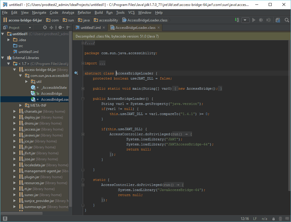
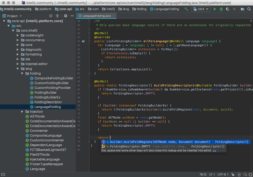
An intelligent IDE for productive Java and JVM development.
Available asOur Price
Also available inOur Price
An intelligent IDE for productive Java and JVM development.
Comprehensive UI components and development libraries subscription.
Complete suite of APIs for document and file processing.
UI components and frameworks for .NET and JavaScript applications.
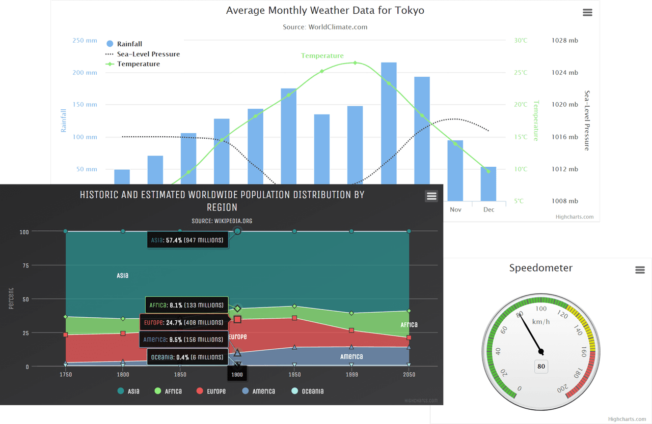
Create responsive, interactive charts with extensive customization options.
Comprehensive suite of developer tools for multiple programming languages.
Robust WinForms UI controls for advanced Windows applications.
Collaborative XML editing in any modern web browser.
Build responsive web apps with rich native Blazor and ASP.NET controls.
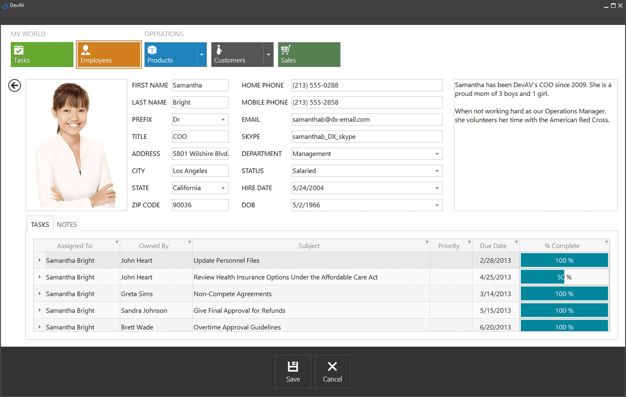
Comprehensive .NET UI components and libraries for cross-platform application development.
Comprehensive JavaScript UI components for modern web and mobile apps.
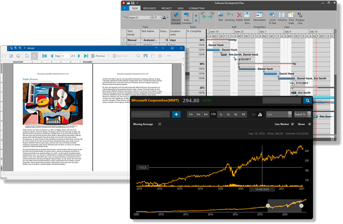
A comprehensive suite of UI controls and document processing libraries.
Complete platform for editing, validating, and publishing XML content.
Comprehensive WPF controls to build high-performance business apps.
Comprehensive .NET and game development toolkit.
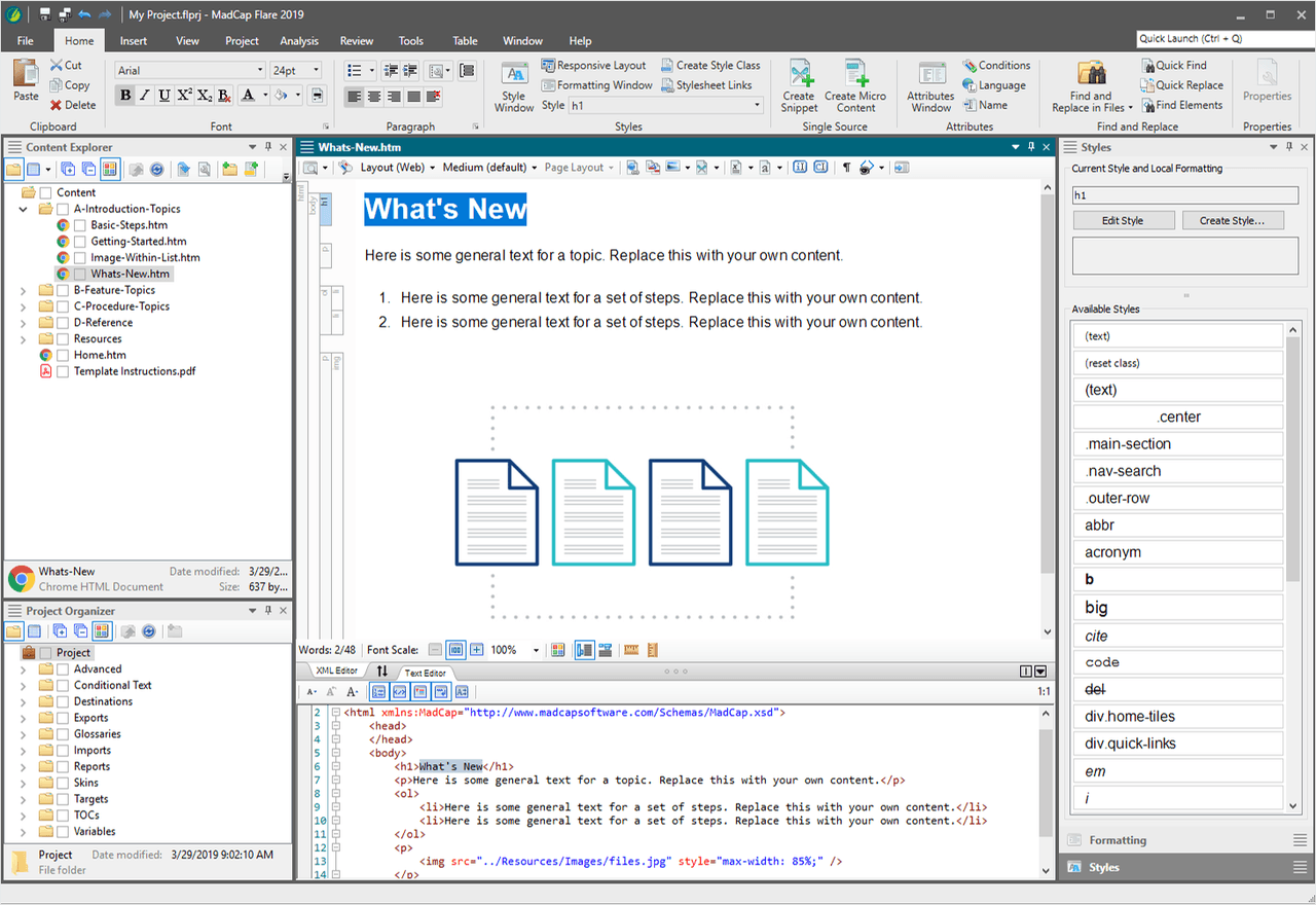
Create, manage, and publish technical content efficiently.
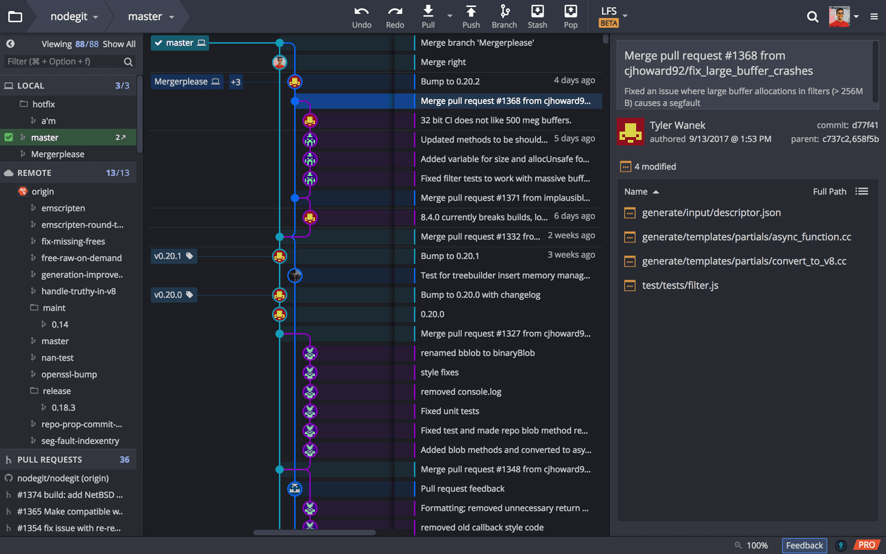
Visual Git client for repository management and team collaboration.
Comprehensive UI component library for modern web and desktop applications.
A comprehensive suite of UI components and productivity tools for developers.
Over 230 powerful VCL components for Delphi and C++Builder development.
Developer subscription providing access to the full /n software component portfolio.
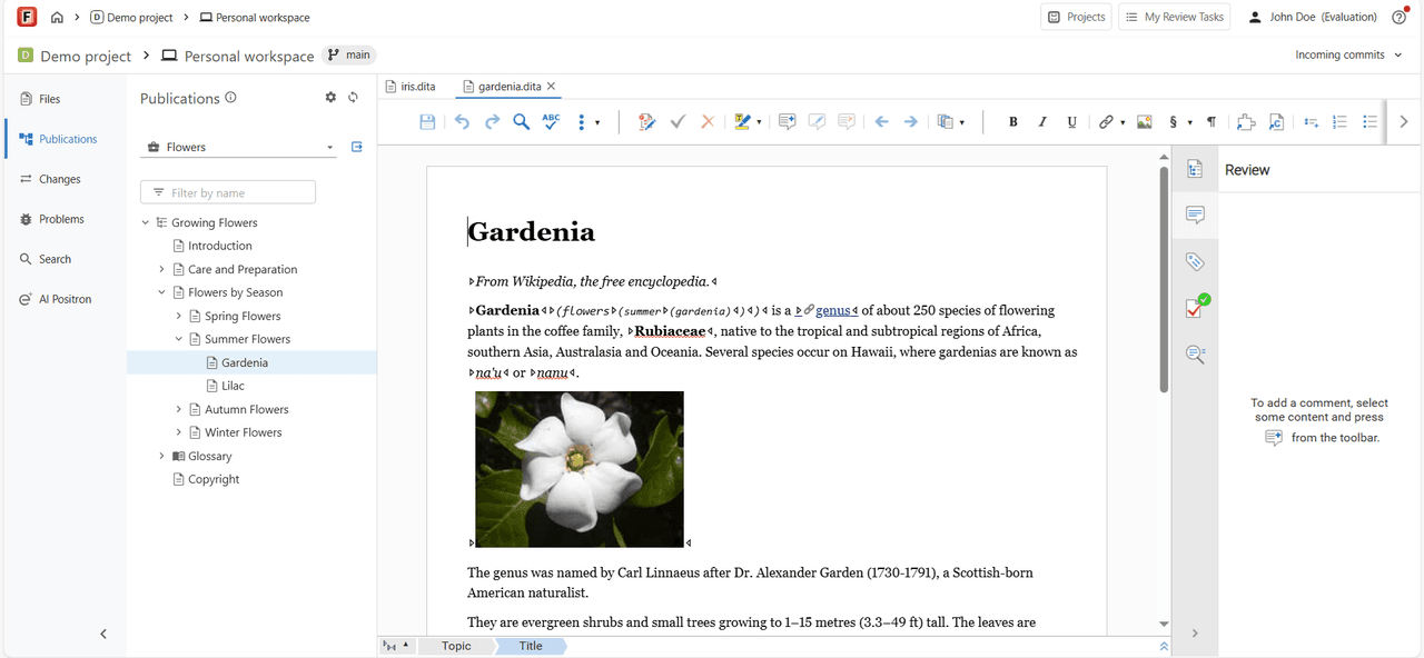
Collaborative structured authoring, review, and publishing for DITA teams.
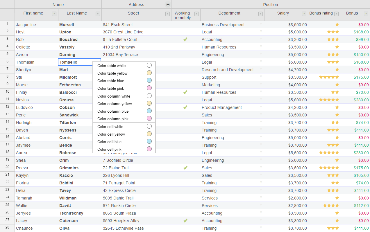
Flexible JavaScript data grid with spreadsheet functionality.
Feature-rich WinForms components for creating modern .NET desktop interfaces.
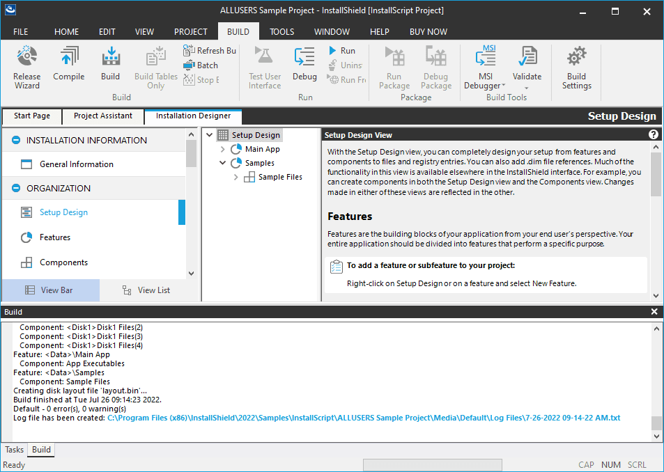
Build professional Windows installers with advanced features.
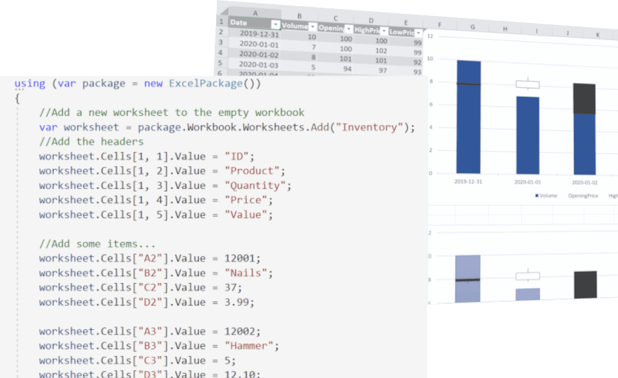
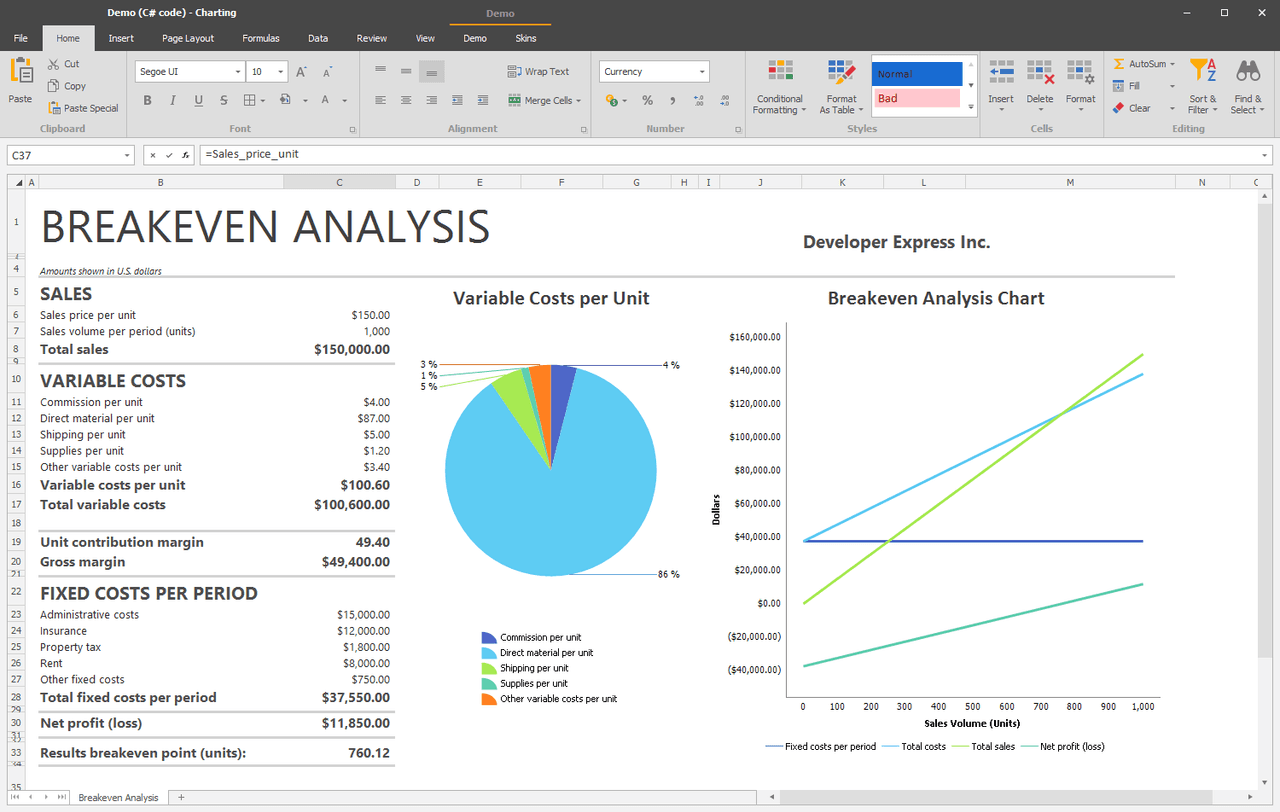
A powerful .NET library for advanced Excel spreadsheet management.
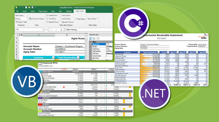
Excel-like .NET spreadsheet components with advanced customization.
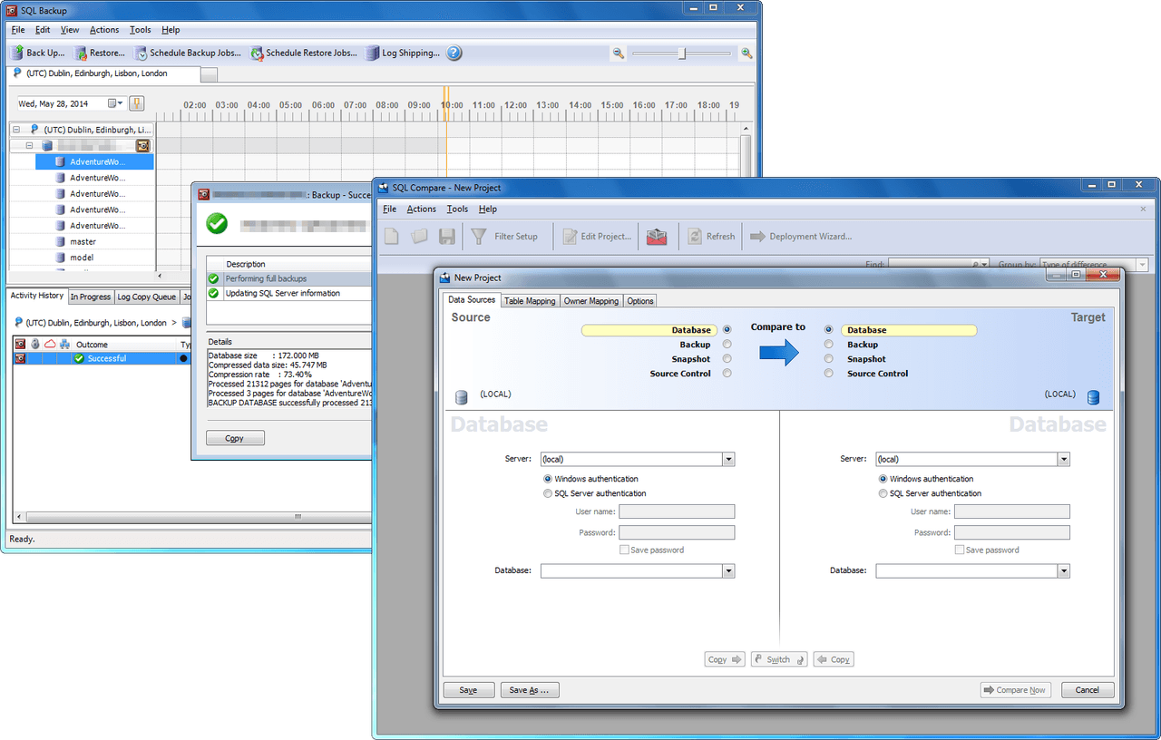
Enhance SQL Server development and deployment with integrated tools.
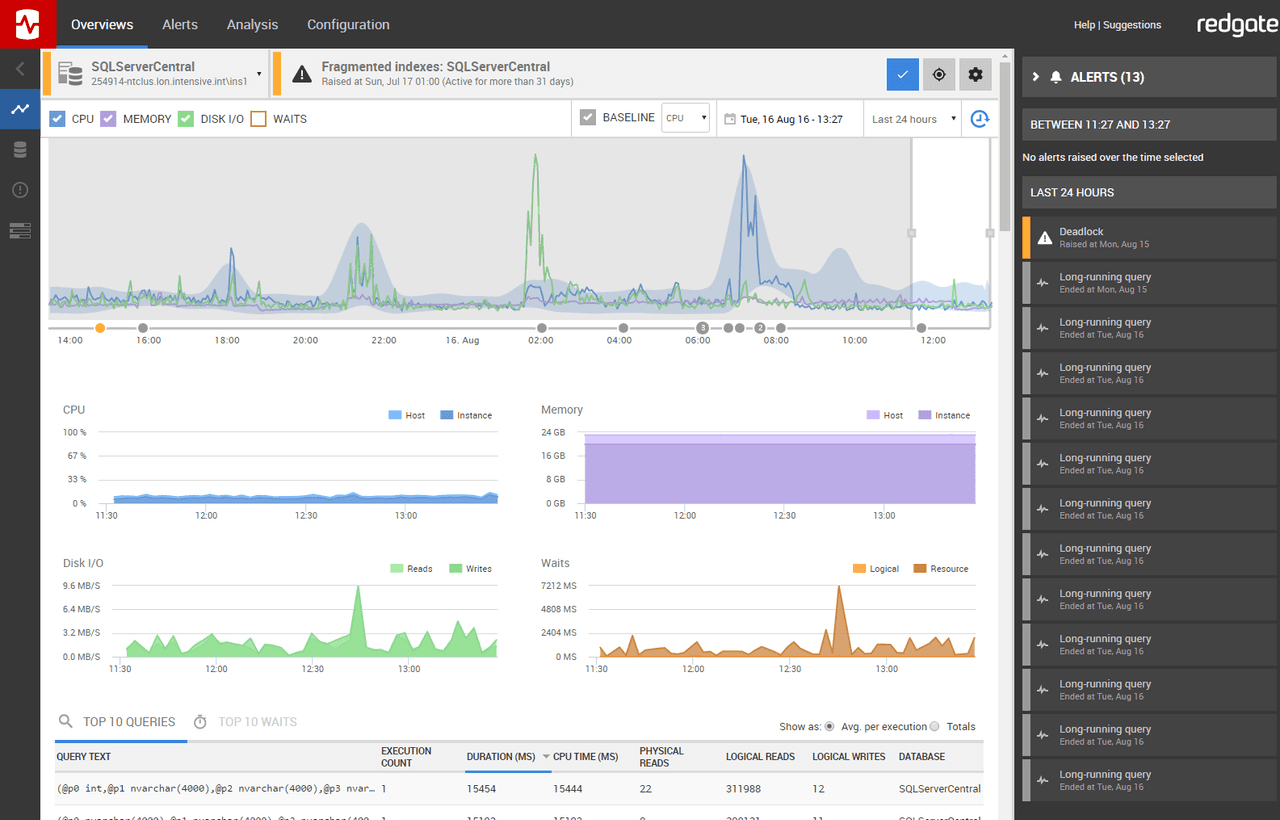
Get comprehensive multi-platform database observability and diagnostics.
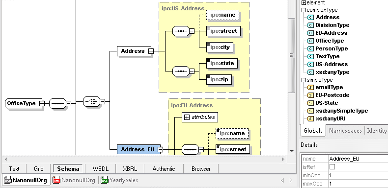
Advanced XML and JSON editor with graphical design and debugging.
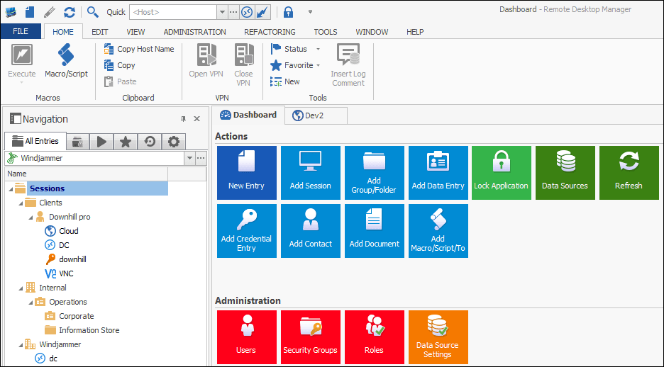
Manage remote connections and credentials from one secure platform.

Comprehensive native JavaScript UI libraries for modern web development.
Comprehensive .NET API for creating and processing office documents.
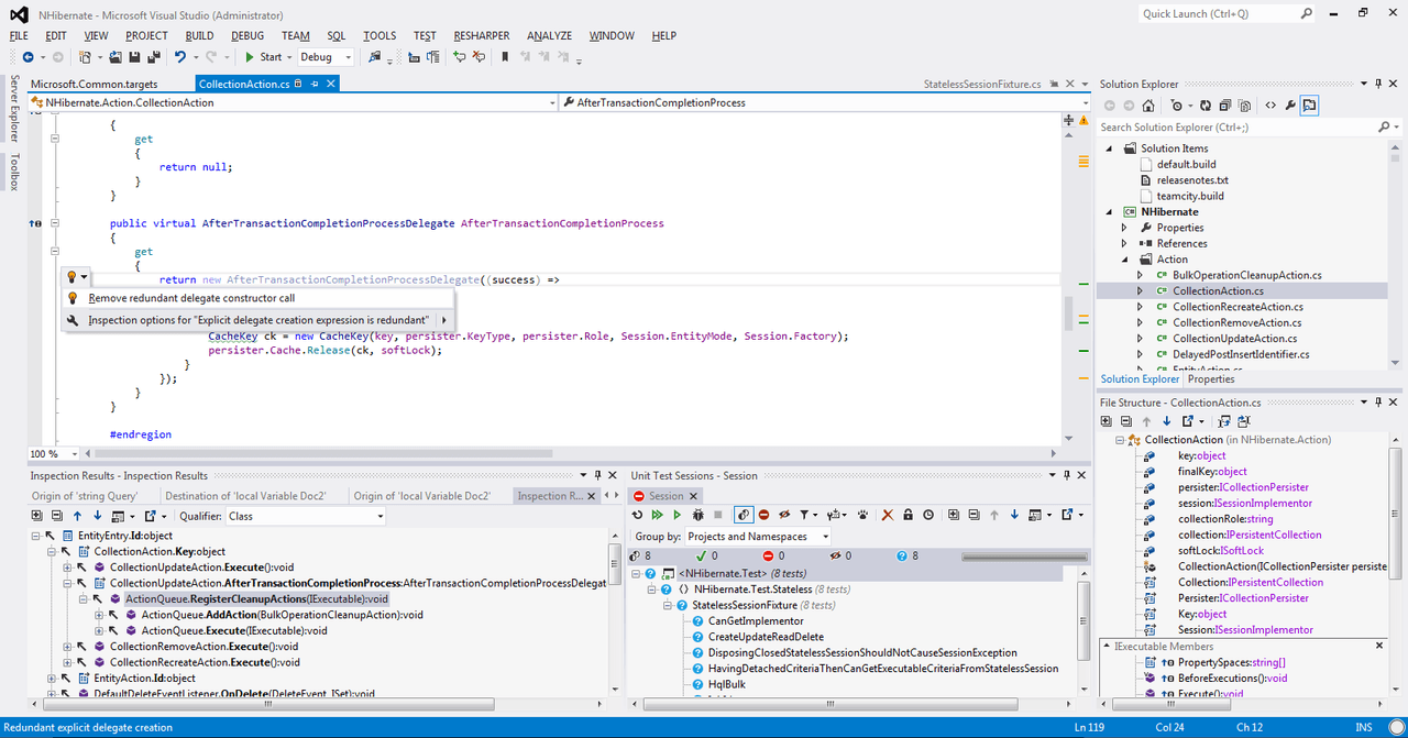
Enhance your Visual Studio coding with powerful productivity features.
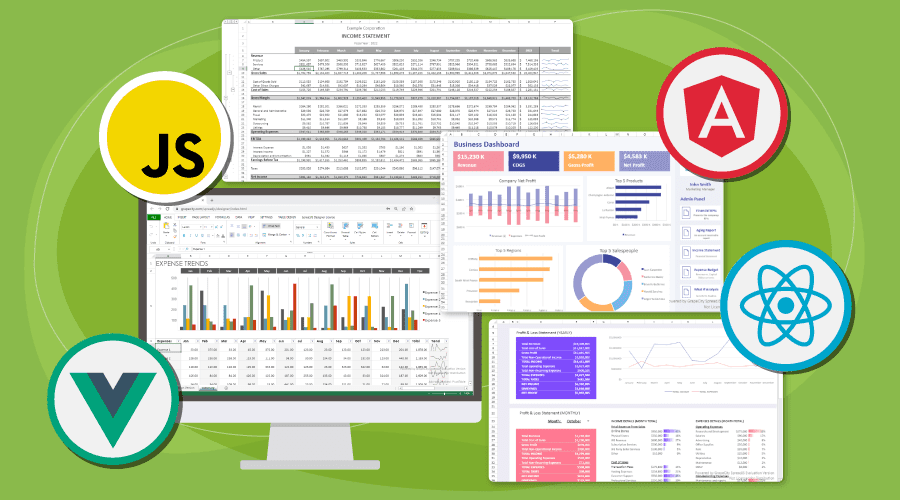
Comprehensive JavaScript spreadsheet component with Excel-like features.

Accelerate web app development with high-performance JavaScript UI controls.
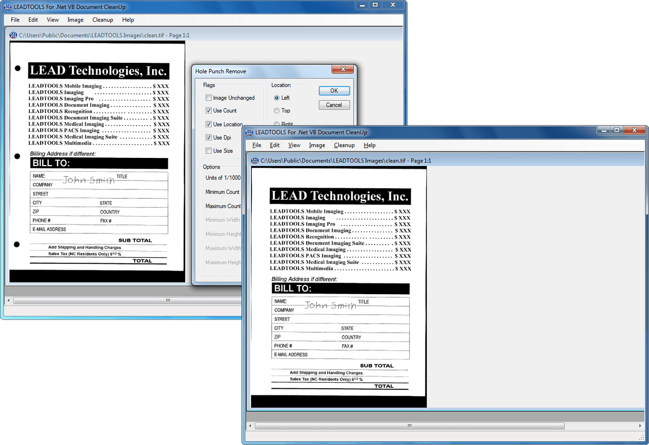
Add document viewing, annotation, scanning, and image processing capabilities.
Create and publish structured XML content efficiently and intuitively.
Comprehensive bundle of developer components for productivity and application support.
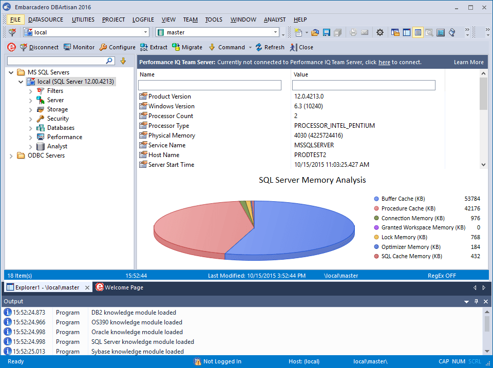
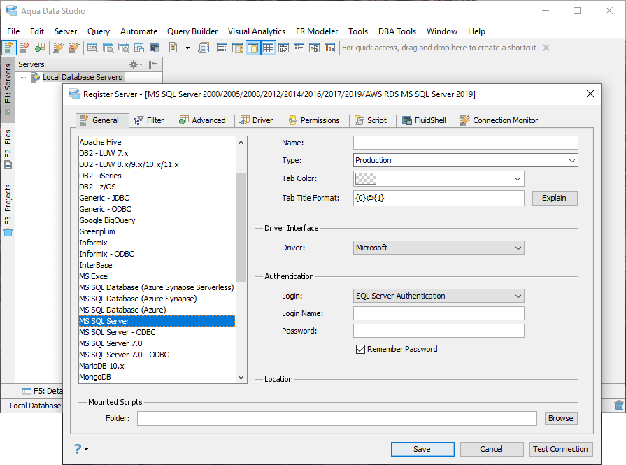
Manage and secure multiple relational databases from one interface.
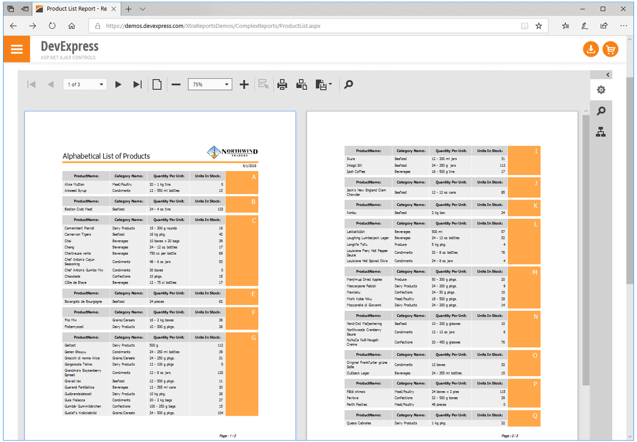
Create versatile, cross-platform .NET reports with ease.
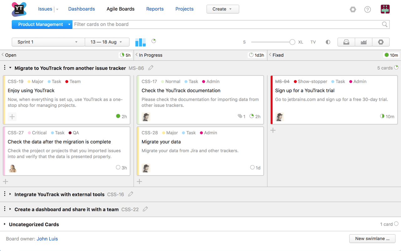
Manage projects and collaborate efficiently with flexible task tracking.
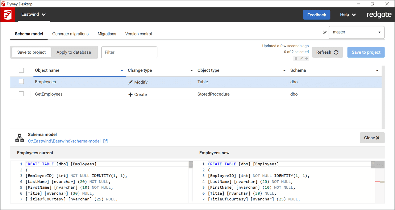
Automate and govern database changes confidently and efficiently.
Manage, analyze, and visualize data with a universal database IDE.
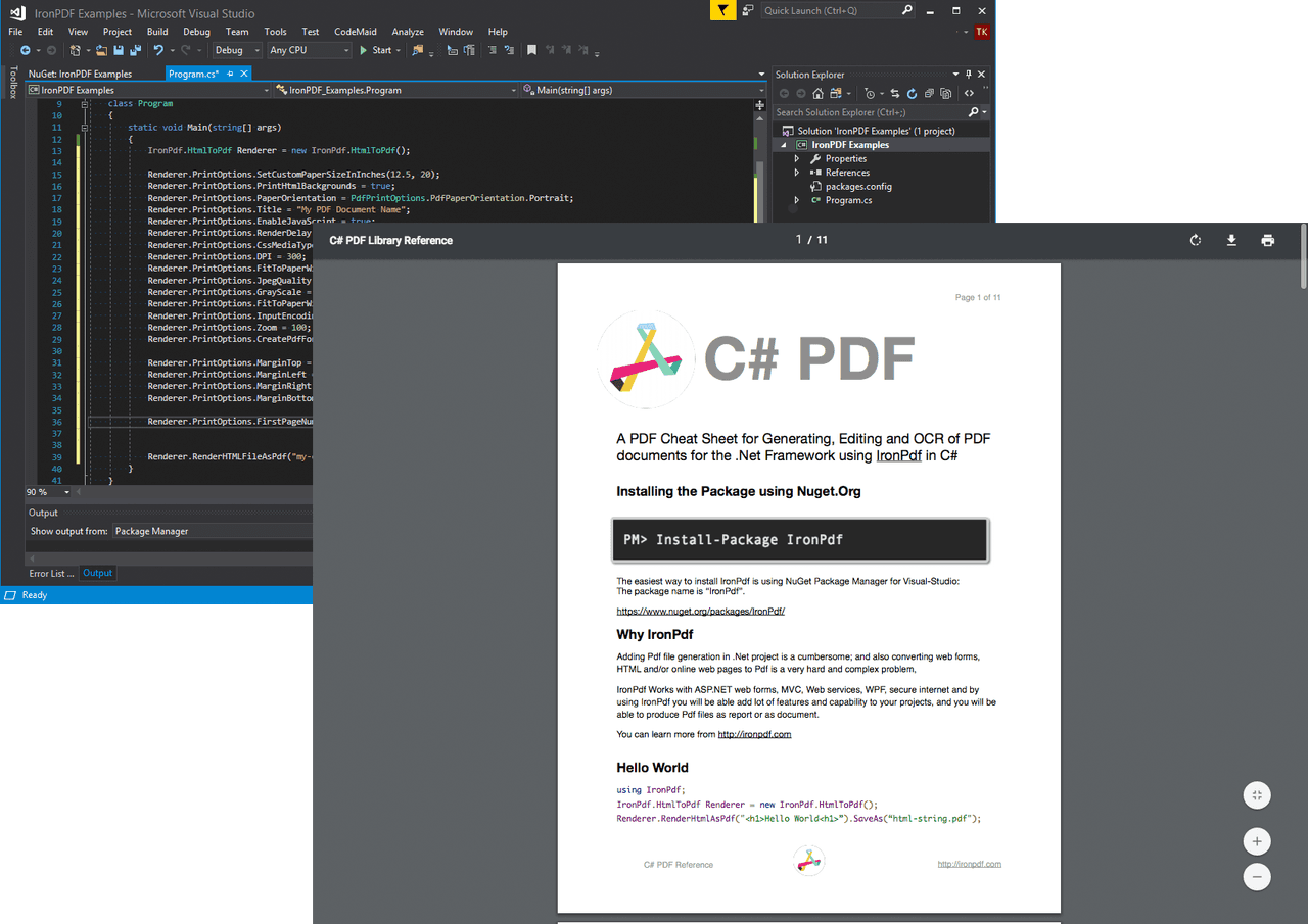
Create, convert, and edit PDFs with a powerful .NET library.
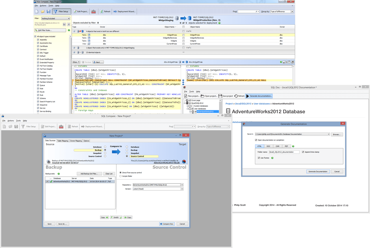
Essential tools to boost SQL Server development and deployment efficiency.
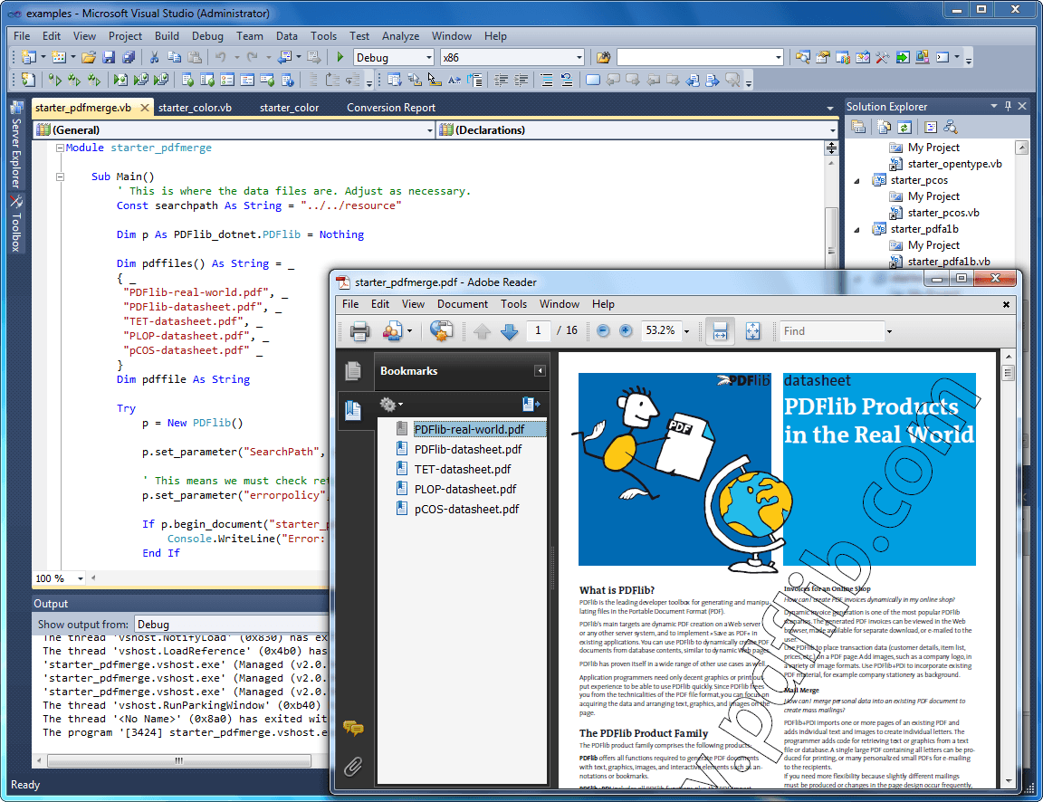
Generate and manipulate PDF documents dynamically with comprehensive programming APIs.
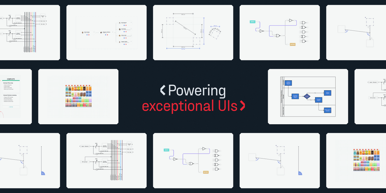
A versatile JavaScript library for advanced diagramming applications.
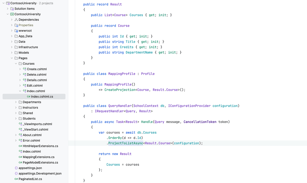
Flexible object mapping library for .NET applications and layered systems.
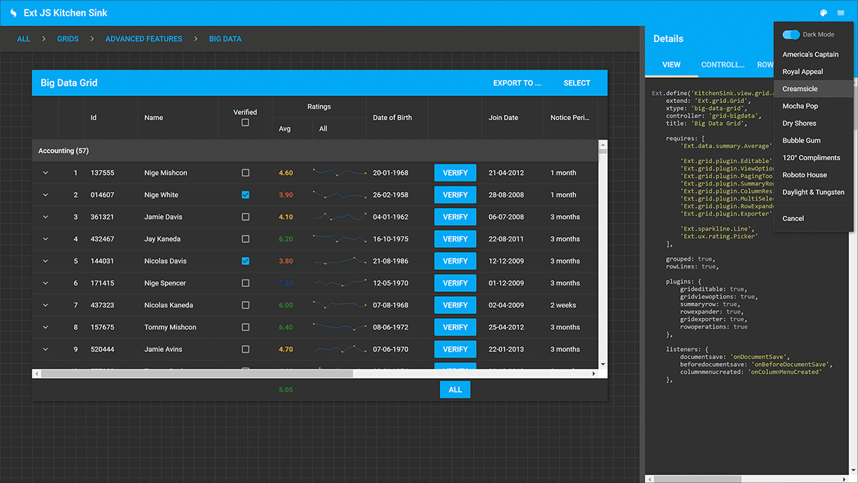
Create data-intensive web applications with a broad JavaScript framework.