Erreichen Sie mehr Nutzer mit zugänglichen Chart-Designs
High-Contrast-Diagramme verbessern die Barrierefreiheit und erhöhen das Verständnis sowie die Inklusivität in Berichten, Dashboards und Präsentationen.
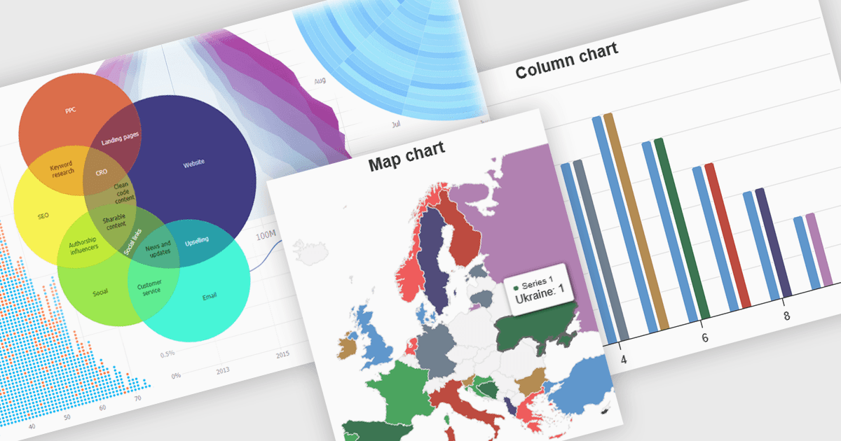
High-Contrast-Diagramme nutzen unterscheidbare und kontrastierende Farbpaletten innerhalb von Datenvisualisierungen, um die Klarheit zu verbessern – insbesondere für Personen mit Sehbeeinträchtigungen. Dabei werden Farben mit deutlich unterschiedlichen Farbtönen und Helligkeiten für Elemente wie Linien, Balken, Beschriftungen und Hintergründe gewählt, sodass Unterschiede in den Daten leicht erkennbar sind. Diese Diagramme verbessern das Verständnis der Daten, machen Informationen für mehr Menschen zugänglich, reduzieren die visuelle Belastung für einige Nutzer und unterstützen die Einhaltung von Barrierefreiheitsstandards. Sie sind in vielen Bereichen nützlich, etwa in Finanzberichten, wissenschaftlichen Arbeiten und Dashboards im Bereich der öffentlichen Gesundheit, die klar sein müssen und für jeden entworfen sind – unabhängig von der Sehfähigkeit.
Mehrere JavaScript-Charting-Komponenten bieten zugängliche High-Contrast-Funktionen, darunter:
- JSCharting rendert zugängliche High-Contrast-Diagramme und verbessert die Datenklarheit sowie die Inklusivität für Nutzer mit Sehbeeinträchtigungen in vielfältigen Anwendungen.
- SmartClient Chart von Isomorphic Software bietet integrierte High-Contrast-Themes und stellt sicher, dass Nutzer mit Sehbeeinträchtigungen komplexe Geschäftsdaten effektiv interpretieren können.
- jQWidgets Chart ermöglicht die Erstellung von High-Contrast-Datenvisualisierungen und verbessert so das Verständnis sowie die Barrierefreiheit für ein breiteres Publikum in Webanwendungen.
- Highcharts Core von Highsoft erleichtert die Umsetzung anpassbarer High-Contrast-Diagramme und fördert die Inklusivität in der Datenrepräsentation für alle Nutzer.
Für eine eingehende Analyse der Funktionen und Preise besuchen Sie unseren Vergleich der JavaScript-Chart-Komponenten.