


Fournisseur officiel
Comme nous somme les distributeurs officiels et autorisés, nous vous fournissons des licences légitimes directement à partir de 200+ éditeurs de logiciels.
Voyez toutes nos marques.
Continuer de lire en anglais:
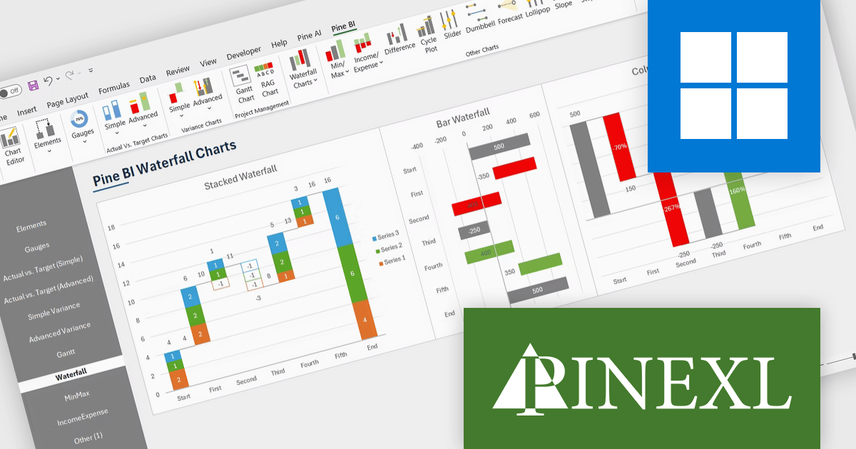
The Pine BI Excel Add-In facilitates the rapid generation of sophisticated and interactive Excel charts, enabling the transformation of standard workbooks into engaging dashboards that improve data visualization. These easily shareable visuals can also be seamlessly integrated into Microsoft Word and PowerPoint, streamlining data analysis workflows and enhancing the creation of impactful reports and presentations across various business applications.
The Pine BI Excel Add-In v2.0 update adds functionality to generate stacked waterfall charts directly within the Excel environment, providing developers with a programmatic and user-friendly method to visualize sequential data contributions to a final value. This embedded feature eliminates the need for external charting libraries or manual data manipulation, streamlining the process of creating insightful visualizations for financial analysis, performance monitoring, and comparative reporting within their Excel-based applications and solutions. Developers can leverage this capability to enhance data presentation and user understanding without requiring specialized charting expertise or reliance on separate tools.
To see a full list of what's new in v2.0, see our release notes.
Pine BI Excel Add-In is licensed annually on a subscription basis with 1, 5, and 10 seat options, requiring renewal for continued use and covering each concurrent computer, with the ability to transfer individual seat activation's as needed. See our Pine BI Excel Add-In licensing page for full details.
For more information, explore the Pine BI Excel Add-In product range.


Tél : (888) 850 9911
Fax : +1 770 250 6199


