Créer des Graphiques en Secteurs Interactifs dans les Applications Vue.js
Visualisez les proportions des catégories avec des graphiques en secteurs responsives comprenant des infobulles, légendes, étiquettes et animations.
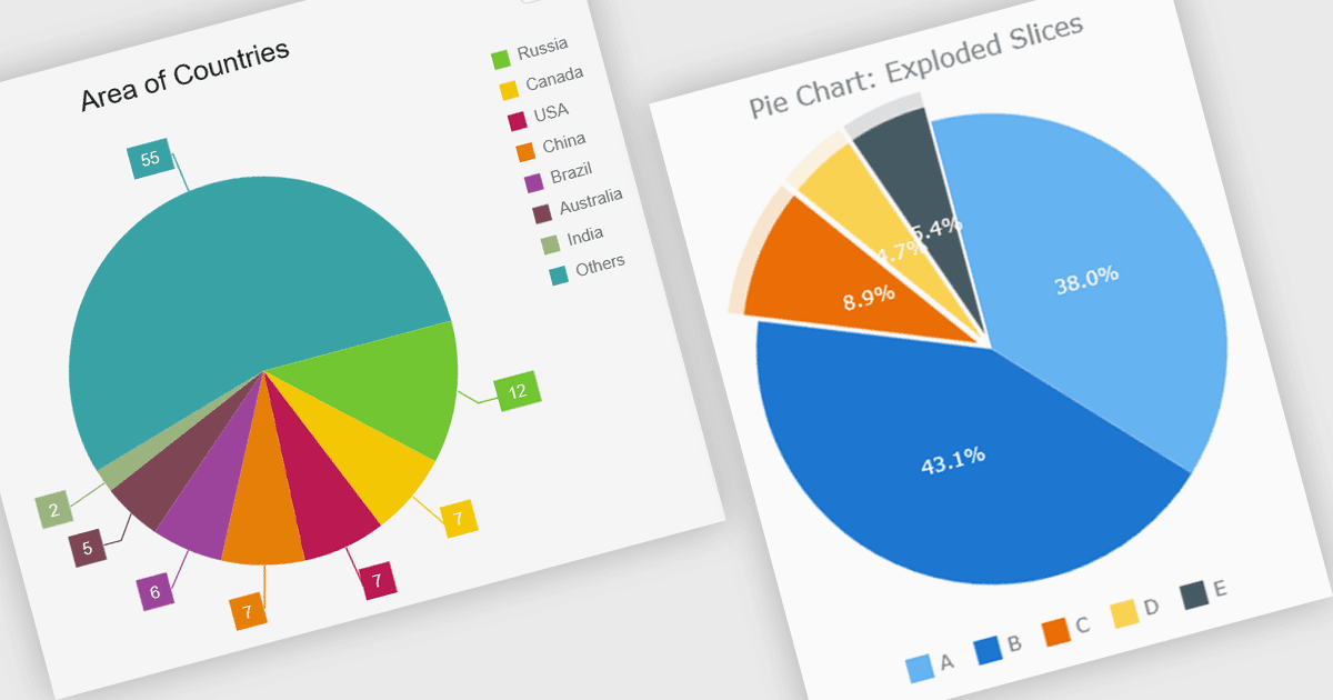
Un graphique en secteurs permet aux développeurs d'afficher des données sous forme de parts proportionnelles d'un cercle, chaque part représentant la part d'une catégorie dans un total unique. Il est bien adapté aux ensembles de données montrant des relations partie-tout, ce qui facilite la comparaison des proportions relatives d'un seul coup d'œil. Une implémentation bien conçue inclut généralement des fonctionnalités interactives telles que des infobulles, légendes, étiquettes, animations, mises en page responsives et options de personnalisation, permettant au graphique de s'intégrer parfaitement dans les applications web modernes tout en fournissant un moyen clair et accessible de présenter des données de composition.
Plusieurs composants graphiques Vue.js prennent en charge les graphiques en secteurs, notamment :
- Highcharts Core vous permet de créer des graphiques en secteurs interactifs avec une personnalisation riche, des mises en page responsives, animations, infobulles, légendes et options de style flexibles.
- DevExtreme Vue Chart (partie de DevExtreme Complete par DevExpress) vous permet de construire des graphiques en secteurs responsives
- avec des parts, étiquettes, légendes, animations personnalisables et des infobulles interactives.
- Kendo UI Vue Charts (partie de Kendo UI par Telerik) facilite la création de graphiques avec des étiquettes configurables, légendes, infobulles, styles et rendu responsif.
- AnyChart JS vous permet de développer des graphiques en secteurs personnalisables avec infobulles interactives, étiquettes configurables, parts éclatées, mises en page responsives et nombreuses options d'apparence.
Pour une analyse approfondie des fonctionnalités et des tarifs, consultez notre comparaison des composants graphiques Vue.js.