WebForm charts rendering as HTML5 Javascript charts.
Many indicators designed to track financial data.
Use multiple axes on charts.
Background ChartBar Chart Series with landscape image background.
Financial MACD ChartThe MACD function (Moving Average Convergence Divergence) on Chart. Indicator specifically designed to track financial data.
Multiple Pies ChartExample of several Pie series within a Chart.
Cylinder ChartCylinder Chart is a Bar chart that use cylinder shape to show data. Sample Cylinder Chart including a grid with Series data values.
Surface ChartSurface plot with transparency and one color for surface filling.
Windows DashboardSample Dashboard Chart created with the TeeChart.Store component being used in Windows.Store.
TechnicalSample Dashboard on Windows Phone device.
Fibonacci ArcsFibonacci Arcs on Chart displayed on Windows Phone device.
GeographicSample Map and horizontal Bar Chart on Windows Phone device.
StatisticsSample Area & Line Chart on Windows Phone device.
Smith ChartInherits most common properties with Polar and Circled ancestor series. Each point is defined with Resistance and Reactance values.
Ternary ChartThe Ternary Series may be used to relate up to five variables. It is particularly interesting as a means to show demographic tendencies or the sensitive relationship between differing dimensions.
Donut ChartStandard Donut using thicker Pen to change the mood transmitted by the Chart.
Contour ChartThe Contour Series displays lines corresponding to same value.
Bubble CloudSample word Bubble Cloud created using coding languages data.
MultiChartSample combination vertical Bar and Pie Chart over a landscape image background.
WeatherRose Series is a combination of a polar chart and a histogram. It plots the frequency or percentage of occurrences data shows up at a particular angle or direction. Mostly used to help visualize cumulative wind direction or wave direction data but also used anytime you need to show a histogram related to direction.
ASPNET Pie ChartPie Chart created with ASP.NET. Charts for the web may be rendered as an ajax animated image or as HTML5 Javascript.
ASPNET MVC Interpolation ChartDynamic interpolation Chart created in MVC using HTML5 Javascript rendering, created with Visual Studio 2017.
ASPNET Chart DrilldownBar Chart in ASP.NET using Javascript as the render mechanism for a completely live Chart on the page. The Chart offers drilldown information on each bar as you pass the mouse over it.
Series ratings ChartThis chart uses the TeeChart WPF Chart to plot popular television series' data using the OMDb API.
InfoGraphicThis example, built with TeeChart for UWP, brings together several charts to form an Infographic on an aspect of Mobile phone use.
Map ChartYou can create maps of the world, continents and countries and customize them using color palette, text and value properties as well as format.
3D Surface ChartSurface displays a grid of XYZ floating point values. Customization options include: Surface palette ( Pale, Strong, Gray scale, Inverted gray and Rainbow) , border, pattern, null values, wire-frame, dots, surface sides, marks, gradients, inverted axes, etc.
3D Surface Chart3D Surface Chart using TeeChart and Microsoft.NET.
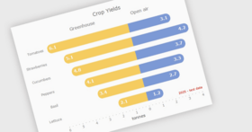
Stacked Bar ChartStacked Bar chart used to represent labour market data for specific time.
Radar ChartA Radar series shows each point at a different angle. Several Radar series can be displayed at the same time, each one with different configuration.
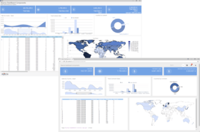
Business Intelligence (BI)Charts being used interactively to help transmit overview and detail message to the application user. Based on Business Intelligence analysis model to bring bound, sourced data to each chart.
Polar ChartSample Polar Chart showing the relationship between two data series. Polar Chart appearance can be customized using Transparency, labels position, background Gradient, smoothing function. Polar charts are used to present data in scientific and mathematic applications.
Stepped PieSample 3D Pie Chart with different heights for different pieces.
Line ChartLine Chart series displays points drawing one line from each point to the next.
Magnify Chart ToolCombination Area, Vertical Bar and Line Chart . This shot specifies a particular region of interest in data which is displayed in the magnified view.
Multiple AxesThe example uses Canvas code to plot the Axis Label Grids according to the number of layers of data to be represented. Custom Axes are created to accomodate each sub-data set.
Point and Figure FunctionPoint and Figure series is a financial chart style. Point & Figure is made of X's and O's symbols representing over time filtered price movements.
Area ChartThe Area style allows single or multiple areas. This is an example of colorful 2D Area Chart with four data sets representing the trend changes over the time.
Financial EquiVolume functionThis Chart Series type, the EquiVolume financial Series, currently available with TeeChart for .NET only, illustrates moving market trade volume and price movement.
Pie Chart XamarinAndroid
Technical Analysis
Cardio VSNET
Direct2D VSNET
Maps VSNET
Financial Chart
PieLight VSNET
Store VSNET
Signal ThroughputIndustrial and electronic data may be represented in real-time.
ElectrocardiogramIdeal charts for the medical profession.