


공식 공급 업체
200 이상의 소프트웨어 개발처와 판매 계약을 맺은 공인 디스트리뷰터로서 합법적인 라이선스를 제공합니다.
모든 브랜드 보기.
영어로 계속 읽기:
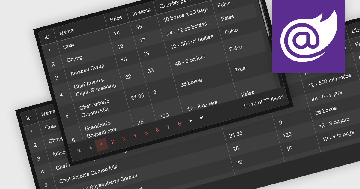
Leveraging a Blazor grid control with responsive layout empowers your application with optimal data visualization across diverse screen sizes and orientations. This enhances the user experience by ensuring seamless navigation, readability, and interaction with grid content, regardless of whether it's being accessed from a desktop computer, tablet, or mobile phone. This flexibility fosters wider accessibility, improves user engagement, and ultimately strengthens the overall value proposition of your Blazor application.
Several Blazor grid controls offer responsive layouts including:
For an in-depth analysis of features and price, visit our Blazor grid controls comparison.
전화 : 00798 14 800 6332
팩스 : +1 770 250 6199


