


공식 공급 업체
200 이상의 소프트웨어 개발처와 판매 계약을 맺은 공인 디스트리뷰터로서 합법적인 라이선스를 제공합니다.
모든 브랜드 보기.
영어로 계속 읽기:
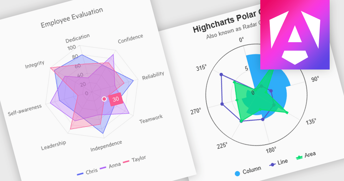
Polar and radar charts provide an intuitive way to visualize multidimensional and circular data. These chart types plot data points relative to a central axis, with polar charts ideal for showcasing proportional relationships, such as seasonal trends or directional metrics, and radar charts excelling at comparing multiple variables, such as performance metrics or skill assessments. Angular’s interactivity enhances engagement with features like tooltips, zooming and real-time updates, making these charts ideal for dashboards and reports. Use cases include analyzing skill assessments, market segmentation, and cyclic trends, delivering clear, actionable insights in a visually compelling format.
Several Angular chart controls offer visual polar and radar chart support including:
For an in-depth analysis of features and price, visit our Angular chart controls comparison:
전화 : 00798 14 800 6332
팩스 : +1 770 250 6199


