


공식 공급 업체
200 이상의 소프트웨어 개발처와 판매 계약을 맺은 공인 디스트리뷰터로서 합법적인 라이선스를 제공합니다.
모든 브랜드 보기.
영어로 계속 읽기:
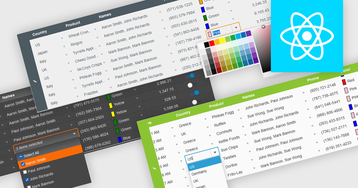
In the field of data editors, themes are style configurations that define the visual appearance and behavior of the interface. They provide developers with a consistent design framework, ensuring alignment with brand guidelines while enhancing usability and accessibility. By supporting features like dark and light modes, responsive design, and unified styling across components, themes enable developers to create a visually cohesive and user-friendly experience. They streamline maintenance, improve scalability, and reduce development overhead by offering a centralized system for managing design updates and ensuring consistency throughout the application.
Several React data editor collections offer support for themes including:
For an in-depth analysis of features and price, visit our React data editor controls comparison.
전화 : 00798 14 800 6332
팩스 : +1 770 250 6199


