반응형 레이아웃으로 사용자 경험을 향상하세요
포용성과 사용성을 우선하는 인터페이스를 설계하여, 어떤 기기에서도 원활한 내비게이션으로 일관된 사용자 경험을 보장하세요.
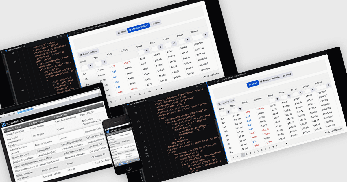
반응형 레이아웃은 웹 및 애플리케이션 인터페이스가 다양한 화면 크기와 기기에 맞춰 구조, 콘텐츠, 요소를 자동으로 조정하고 최적화할 수 있게 해주는 디자인 접근 방식입니다. 유연한 그리드, 확장 가능한 이미지, 적응형 컴포넌트를 사용함으로써 반응형 레이아웃은 데스크톱, 태블릿, 모바일 기기 전반에서 일관되고 사용자 친화적인 경험을 보장합니다. 소프트웨어 개발자에게 이 방식은 크로스플랫폼 애플리케이션 생성을 단순화하고, 접근성을 개선하며, 다양한 환경에서도 인터페이스가 원활하게 작동하도록 구현해 사용자 만족도를 높여줍니다.
여러 Angular 그리드 컴포넌트가 반응형 레이아웃을 지원합니다. 예:
- IntegralUI Grid (Lidor Systems의 IntegralUI Web 일부) 를 통해 반응형 레이아웃을 갖춘 맞춤형 데이터 그리드를 만들 수 있어, 기기 전반에서 원활한 성능을 보장합니다.
- Handsontable (Handsoncode) 은 반응형, 엑셀과 같은 그리드를 통해 직관적인 데이터 관리를 지원하며, 다양한 화면 크기에 맞춰 동적으로 적응하여 최대의 사용성을 제공합니다.
- Kendo UI for Angular Grid (Telerik의 Kendo UI 일부) 는 강력한 데이터 처리와 기기 및 해상도 전반의 일관성을 바탕으로 개발자가 그리드를 만들 수 있도록 지원합니다.
- DevExtreme HTML5 JavaScript Data Grid (DevExpress의 DevExtreme Complete 일부) 는 적응형 레이아웃과 고급 편집을 결합해 반응형 데이터 표현을 가능하게 합니다.
기능과 가격을 자세히 살펴보려면 Angular 그리드 컨트롤 비교를 방문하세요.