


공식 공급 업체
200 이상의 소프트웨어 개발처와 판매 계약을 맺은 공인 디스트리뷰터로서 합법적인 라이선스를 제공합니다.
모든 브랜드 보기.
영어로 계속 읽기:
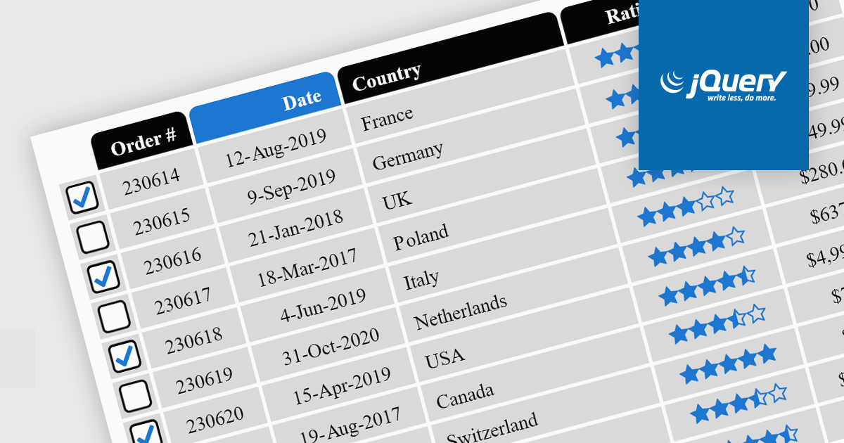
Cell types in Grid components are specialized configurations that define how data is displayed, edited, and interacted with within a grid or table structure. They allow developers to tailor the presentation and functionality of each cell to better match the type of data it contains. By specifying cell types such as text, numeric, date/time, and more, Grid components can provide intuitive controls and formatting automatically, streamlining data entry and reducing errors.
Common features include:
For an in-depth analysis of features and price, visit our jQuery grid components comparison.
전화 : 00798 14 800 6332
팩스 : +1 770 250 6199


