


공식 공급 업체
200 이상의 소프트웨어 개발처와 판매 계약을 맺은 공인 디스트리뷰터로서 합법적인 라이선스를 제공합니다.
모든 브랜드 보기.
영어로 계속 읽기:
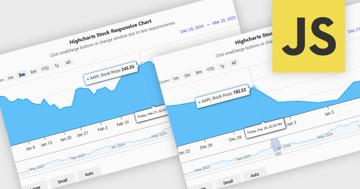
Responsive behavior in chart controls refers to the automatic adjustment of a chart’s layout, dimensions, and visual elements to fit the screen size or container in which it is rendered. This functionality ensures that charts remain readable and usable across a wide range of devices, from desktops to tablets and smartphones, without requiring manual configuration for each format. The benefits include reduced development overhead, improved user experience, and consistent presentation of data regardless of platform. Common use cases include dashboards in web applications, analytics platforms, and mobile-first reporting tools, where users expect seamless interaction and clear data visualization across multiple device types.
Several JavaScript chart controls support responsive behavior, including:
For an in-depth analysis of features and price, visit our JavaScript chart controls comparison.
전화 : 00798 14 800 6332
팩스 : +1 770 250 6199


