접근 가능한 차트 디자인으로 더 많은 사용자를 확보하세요
고대비 차트는 접근성을 향상시켜 보고서, 대시보드, 프레젠테이션에서 이해도와 포용성을 높입니다.
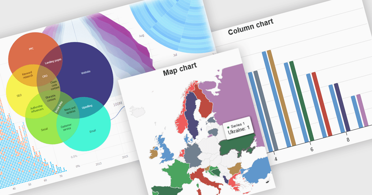
고대비 차트는 데이터 시각화에서 서로 구별되고 대비되는 색상 팔레트를 사용하여 가독성을 높이며, 특히 시각 장애가 있는 사람들에게 명확성을 개선합니다. 이를 위해 선, 막대, 라벨, 배경과 같은 요소에 대해 눈에 띄게 다른 색상 톤과 밝기를 선택하여 데이터의 차이를 쉽게 알아볼 수 있도록 합니다. 이러한 차트는 데이터 이해를 돕고 더 많은 사람들에게 정보를 접근 가능하게 만들며, 일부 사용자의 눈 피로를 줄이고 접근성 표준을 지원합니다. 재무 보고서, 과학 논문, 그리고 시각 능력과 관계없이 모두를 위해 명확하고 설계되어야 하는 공중 보건 대시보드 등 다양한 분야에서 유용합니다.
여러 JavaScript 차트 구성 요소에서 접근 가능한 고대비 기능을 제공하며, 여기에는:
- JSCharting은 접근 가능한 고대비 차트를 렌더링하여 데이터 명확성과 포용성을 높이고, 시각 장애가 있는 사용자가 다양한 애플리케이션에서 데이터를 더 잘 이해할 수 있도록 지원합니다.
- SmartClient Chart by Isomorphic Software는 기본 제공 고대비 테마를 제공하여 시각 장애가 있는 사용자가 복잡한 비즈니스 데이터를 효과적으로 해석할 수 있도록 합니다.
- jQWidgets Chart enables the creation of high contrast data visualizations, improving comprehension and accessibility for a broader audience in web applications.
- Highcharts Core by Highsoft는 맞춤형 고대비 차트의 구현을 지원하여 모든 사용자를 위한 데이터 표현에서 포용성을 촉진합니다.
기능과 가격에 대한 심층 분석은 JavaScript 차트 구성 요소 비교에서 확인하세요.