


공식 공급 업체
200 이상의 소프트웨어 개발처와 판매 계약을 맺은 공인 디스트리뷰터로서 합법적인 라이선스를 제공합니다.
모든 브랜드 보기.
영어로 계속 읽기:
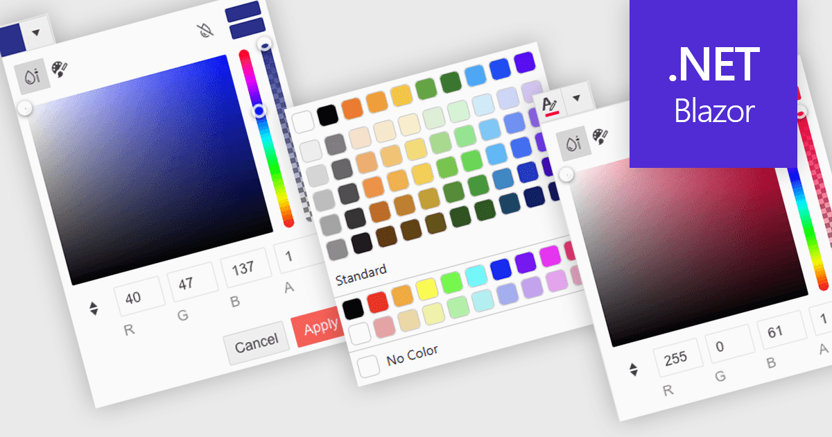
A color picker is a user interface element that allows users to choose and apply colors to specific parts of their data without writing any code. It typically appears as a small palette or input box that, when clicked, opens a panel with color options like swatches, sliders, or hex code fields. This feature supports intuitive visual customization, enabling users to highlight patterns, mark important values, or align with corporate color schemes. In advanced editors, color pickers also support themes or accessibility settings, such as high-contrast palettes.
Several .NET Blazor data editors can provide you with a color picker, including:
For an in-depth analysis of features and price, visit our .NET Blazor data editors comparison.
전화 : 00798 14 800 6332
팩스 : +1 770 250 6199


