


공식 공급 업체
200 이상의 소프트웨어 개발처와 판매 계약을 맺은 공인 디스트리뷰터로서 합법적인 라이선스를 제공합니다.
모든 브랜드 보기.
영어로 계속 읽기:
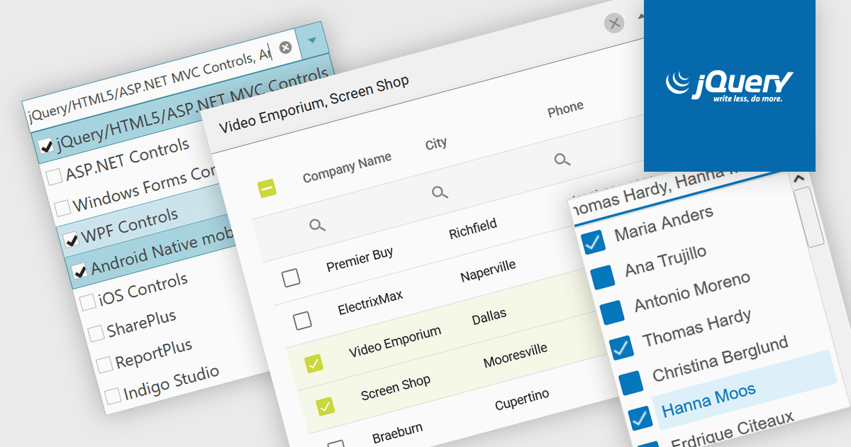
A checked combobox is a data editor component used in user interfaces that consists of a text box with a drop-down panel. This panel displays a predefined list of items, in a clean and organized layout, from which users can input data by making a singular or multiple selections using the adjacent checkboxes. The values are then typically displayed as a comma-separated summary in the collapsed field. This type of control provides developers with a convenient way to implement multi-select functionality within their applications, and is especially effective in scenarios such as filtering datasets or configuring settings, without consuming additional space on the interface.
Several jQuery data editor collections include checked comboboxes, including:
For an in-depth analysis of features and price, visit our comparison of jQuery data editors.
전화 : 00798 14 800 6332
팩스 : +1 770 250 6199


