지도 차트로 지역별 추세 시각화
값을 쉽게 비교하고, 지역별 패턴을 드러내며, 실행 가능한 인사이트를 발견할 수 있도록 생생한 지도 차트로 데이터를 변환하세요.
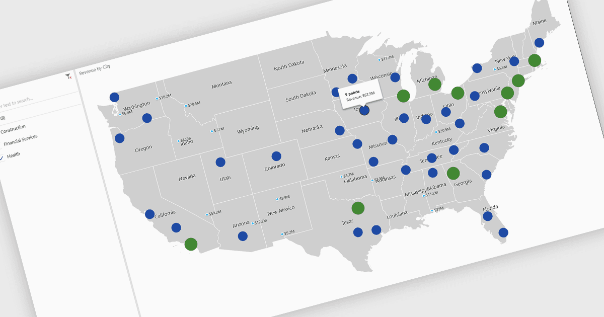
지도 차트는 색상, 음영 또는 마커를 사용하여 지리적 지역에 걸쳐 데이터를 표시하는 시각적 표현으로, 복잡한 정보를 더 쉽게 해석할 수 있도록 해줍니다. 데이터를 공간적 맥락에 배치함으로써 지도 차트는 사용자가 전통적인 표나 그래프에서는 놓치기 쉬운 지역별 패턴, 추세, 이상치를 빠르게 파악하도록 돕습니다. 지도 차트는 국가, 주 또는 카운티 간 값을 비교하는 데 특히 유용하며, 지리적으로 분산된 데이터에서 더 명확한 인사이트를 제공합니다. 일반적인 활용 사례로는 인구 밀도 시각화, 선거 결과 강조, 지역별 판매 성과 분석, 경제 지표 제시 등이 있습니다. 지도 차트의 핵심 이점은 복잡한 데이터셋을 단순화하고, 직관적인 비교를 제공하며, 숫자를 실제 위치와 시각적으로 연결해 데이터 기반 의사결정을 지원한다는 점입니다.
몇 가지 .NET Core 차트 컨트롤에서 지도 차트를 제공합니다. 예:
- DevExpress WinForms Chart (DevExpress WinForms의 일부)에서는 사용자 지정 가능한 지도 차트를 통해 지리 데이터를 시각화하여 정확한 지역별 비교를 할 수 있습니다.
- ComponentOne Charts for WinForms (MESCIUS의 ComponentOne Studio WinForms의 일부)에서는 공간 데이터셋을 대화형 지도 차트로 변환할 수 있습니다.
- Telerik WPF Chart (Telerik UI for WPF의 일부)에서는 지도 차트를 통해 강력한 지리적 스토리텔링을 지원하여 사용자가 추세를 파악하고 지역별 성과를 탐색할 수 있게 합니다.
- Infragistics WPF Charts (Infragistics Ultimate UI for WPF의 일부)에서는 지도 차트를 활용해 데이터의 맥락을 기반으로 분석할 수 있으며, 직관적인 디자인과 명확한 시각화를 결합합니다.
기능과 가격에 대한 심층 분석은 .NET Core 차트 컨트롤 비교를 방문하세요.