


공식 공급 업체
200 이상의 소프트웨어 개발처와 판매 계약을 맺은 공인 디스트리뷰터로서 합법적인 라이선스를 제공합니다.
모든 브랜드 보기.
영어로 계속 읽기:
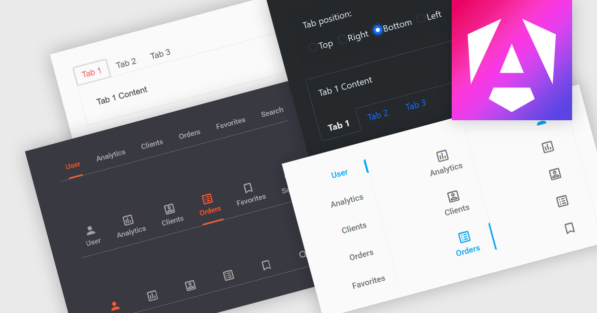
Tabs are a common user interface element that allows users to navigate between multiple sections or views within the same window by clicking on labeled tabs, typically displayed in a row. Each tab presents a different set of information or controls, helping to organize content in a way that reduces clutter and makes it easier to find relevant features without switching between multiple windows or pages. Creating a tabbed UI to switch between sections provides faster access to key areas, and improves usability by maintaining context. This approach is especially useful in applications with layered data or multiple tool sets, where managing space and context is critical.
Several Angular UI suites provide you with tab functionality, including:
For an in-depth analysis of features and price, visit our comparison of Angular UI suites.
전화 : 00798 14 800 6332
팩스 : +1 770 250 6199


