콤보박스 컨트롤로 정확한 값 선택하기
콤보박스 Web Components는 필터링, 자동완성, 키보드 지원을 통해 유효성 검증된 데이터 입력을 간소화하며, 어떤 폼에도 손쉽게 통합하도록 설계되었습니다.
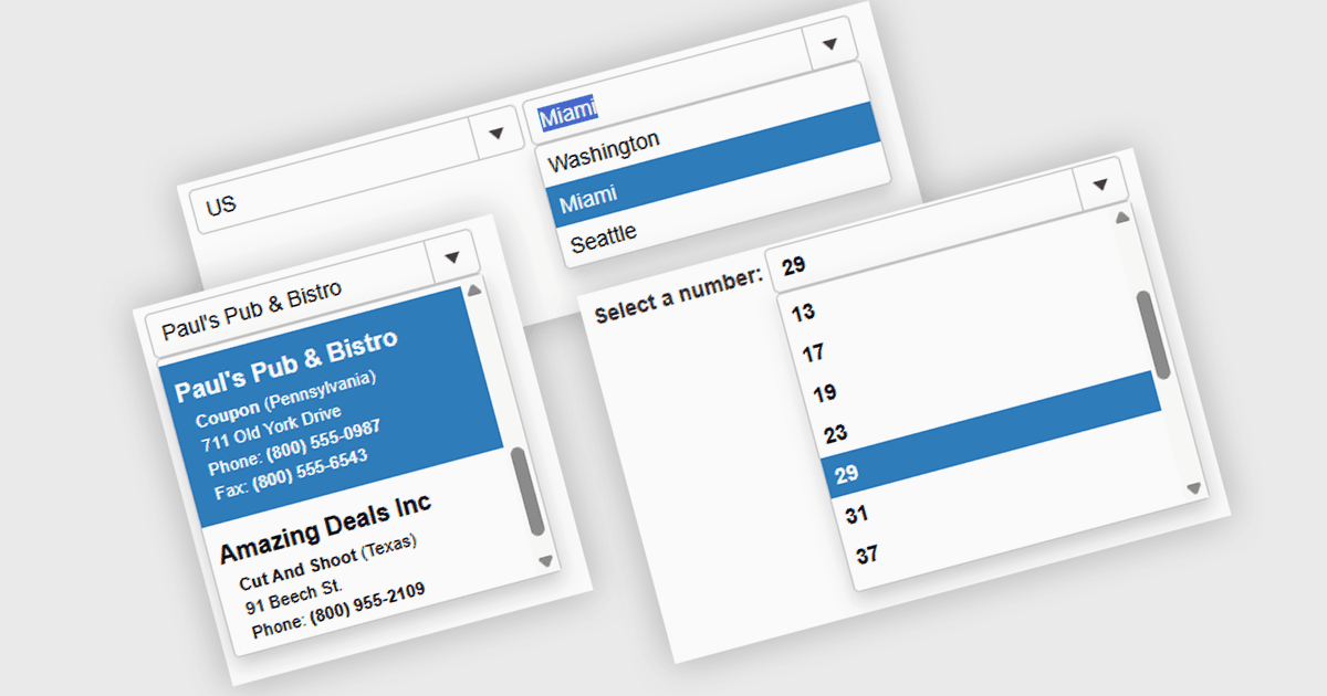
콤보박스 Web Components 컨트롤은 입력 필드와 드롭다운 목록을 결합한 사용자 인터페이스 요소로, 사용자가 값을 직접 입력하거나 미리 정의된 옵션에서 선택할 수 있게 해줍니다. 특히 입력값이 알려진 값의 집합과 일치해야 하는 경우 데이터 입력을 간소화하는 데 흔히 사용됩니다. 필터링, 자동완성, 키보드 탐색과 같은 기능을 지원함으로써 콤보박스는 접근성을 높이고 폼이나 대화형 컴포넌트에서 사용자 경험을 개선합니다. 또한 입력 오류가 발생할 가능성을 줄여 데이터 기반 애플리케이션에서 일관성과 유효성 검증을 유지하는 데도 도움이 됩니다.
여러 Web Components 데이터 에디터에서 콤보박스를 제공하며, 예를 들면 다음과 같습니다:
- Wijmo Input and Editors (MESCIUS의 Wijmo)에서는 바운드 데이터 지원, 사용자 정의 항목 템플릿, 키보드 탐색, 자동완성을 갖춘 경량 콤보박스를 만들 수 있습니다.
- jQWidgets Data Editors (jQWidgets의 일부)에서는 내장 필터링, 키보드 지원, 동적 항목 렌더링, 로컬 데이터와의 통합을 통해 콤보박스 컨트롤을 사용할 수 있습니다.
- SmartUI (Smart HTML Elements) Data Editors (SmartUI (Smart HTML Elements)의 일부)에서는 실시간 검색, 키보드 상호작용, 템플릿 항목, 최신 JavaScript 프레임워크와의 호환성을 제공하는 사용자 지정 가능한 콤보박스 컴포넌트를 제공합니다.
- Infragistics Ignite UI for Web Components Data Editors (Infragistics Ignite UI의 일부)에서는 필터링, 단일 선택, 키보드 탐색을 지원하고 가상화를 통해 대용량 데이터셋을 처리하는 콤보박스를 구성할 수 있습니다.
기능과 가격에 대한 심층 분석은 Web Components 데이터 에디터 비교를 참고하세요.