유연한 툴바로 명령을 정리하기
전용 툴바에 관련 작업을 그룹화하여 사용자가 일반적인 작업을 더 빠르고 더 적은 인터페이스 상호 작용으로 완료할 수 있도록 도와줍니다.
2026년 3월 6일기능 강조
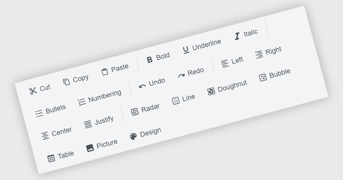
툴바 구성 요소는 현대 Angular UI 제품군의 일반적인 기능으로, 애플리케이션 내에서 자주 사용되는 명령을 구조화된 방식으로 제시합니다. 일반적으로 버튼, 아이콘, 인터랙티브 컨트롤이 가로 또는 세로 막대 형태로 표시되는 툴바는 개발자가 작업을 명확하고 쉽게 접근할 수 있는 위치에 정리하도록 돕습니다. Angular 기반 애플리케이션에서 툴바 구성 요소는 프레임워크의 컴포넌트 아키텍처와 함께 작동하도록 설계되는 경우가 많으며, 템플릿, 반응형 레이아웃, 메뉴, 드롭다운, 입력 컨트롤 같은 다른 UI 요소와의 통합을 지원합니다. 이를 통해 개발자는 기능이 사용자에게 어떻게 노출되는지에 있어 유연성을 유지하면서도 일관된 명령 영역을 구축할 수 있습니다.
여러 Angular UI 제품군에서 다음과 같은 툴바 구성 요소를 제공합니다:
- DevExtreme Complete by DevExpress는 적응형 레이아웃과 항목 템플릿을 지원하는 Angular Toolbar 컨트롤을 포함합니다.
- Kendo UI by MESCIUS는 개발자가 명령 버튼, 분할 버튼 및 기타 인터랙티브 요소를 그룹화할 수 있게 해주는 기본 Angular Toolbar 구성 요소를 제공합니다.
- Syncfusion Essential Studio UI Component Suite는 항목 그룹화, 템플릿 콘텐츠, 반응형 오버플로 모드를 지원하는 Angular Toolbar 컨트롤을 제공합니다.
- jQWidgets는 개발자가 명령 버튼과 사용자 지정 위젯을 유연한 레이아웃으로 배치할 수 있게 하는 Toolbar 구성 요소를 포함합니다.
기능과 가격에 대한 심층 분석은 Angular UI 제품군 비교를 방문하세요.