Heat Map 차트로 추세 강조
차트 구성 요소 내에서 행렬 스타일 데이터 세트 전반의 패턴과 이상치를 드러내기 위해 색상 기반 데이터 표현을 사용하세요.
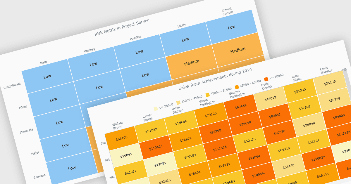
히트 맵은 색상 셀 그리드에 값을 표시하는 데이터 시각화로, 색상 강도는 데이터의 크기나 중요성을 나타냅니다. 이 접근 방식은 전통적인 표에서는 보기 어려울 수 있는 패턴, 추세, 이상치를 빠르게 식별하는 데 도움이 됩니다. 히트 맵은 두 변수 간의 관계를 시각적으로 강조하고 데이터 세트 전반에서 빠른 비교를 가능하게 하여 데이터 분석을 향상시킵니다. 이러한 차트는 일반적으로 위험 매트릭스, 성능 모니터링, 판매 분석, 사용자 행동 추적에 사용되며, 색상으로 구분된 인사이트가 사용자가 가장 중요한 정보에 집중하도록 돕습니다.
여러 JavaScript 차트 컨트롤이 Heat map 차트 유형을 지원하며, 다음이 포함됩니다:
- Highcharts Core by Highsoft는 색상으로 구분된 값으로 매트릭스 데이터를 시각화하는 대화형 히트맵을 만들어 패턴, 추세, 범주 간 비교를 드러낼 수 있게 해줍니다.
- LightningChart JS는 GPU 가속을 사용하여 대규모 데이터 세트용 고성능 히트맵을 렌더링하고, 패턴, 강도, 상관관계를 실시간으로 드러낼 수 있게 합니다.
- AnyChart JS는 표 형식 데이터를 색상 인코딩된 그리드로 변환하는 사용자 지정 가능한 히트맵을 쉽게 만들 수 있게 하여, 사용자가 추세, 상관관계, 데이터 분포를 감지하도록 돕습니다.
- JSCharting은 색상 범위를 통해 값의 강도를 강조하는 대화형 히트맵을 구축할 수 있게 하여, 빠른 비교, 패턴 발견, 직관적인 분석을 가능하게 합니다.
기능과 가격에 대한 심층 분석은 JavaScript 차트 컨트롤 비교를 방문하세요.