


공식 공급 업체
200 이상의 소프트웨어 개발처와 판매 계약을 맺은 공인 디스트리뷰터로서 합법적인 라이선스를 제공합니다.
모든 브랜드 보기.
영어로 계속 읽기:
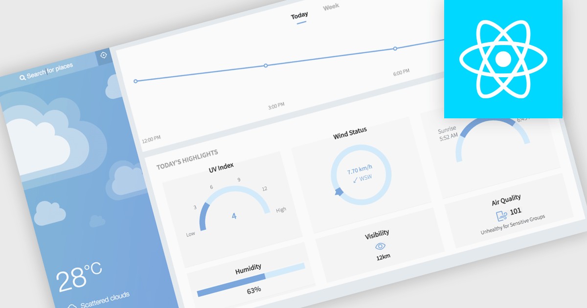
Gauge charts are data visualizations that display a single value within a defined range, making it easy to understand status or progress at a glance. Often styled like a speedometer, they show where a value sits between minimum and maximum thresholds, using color to indicate different levels. This provides clear, immediate insight without detailed analysis. Key benefits include quick understanding, intuitive design, and strong visual emphasis on limits or targets. Gauge charts are commonly used in dashboards to track KPIs, monitor targets, show completion percentages, or highlight key metrics in a simple and effective way.
Several React charting components also offer gauges, including:
For an in-depth analysis of features and price, visit our comparison of React chart components.
전화 : 00798 14 800 6332
팩스 : +1 770 250 6199


