


공식 공급 업체
200 이상의 소프트웨어 개발처와 판매 계약을 맺은 공인 디스트리뷰터로서 합법적인 라이선스를 제공합니다.
모든 브랜드 보기.
영어로 계속 읽기:
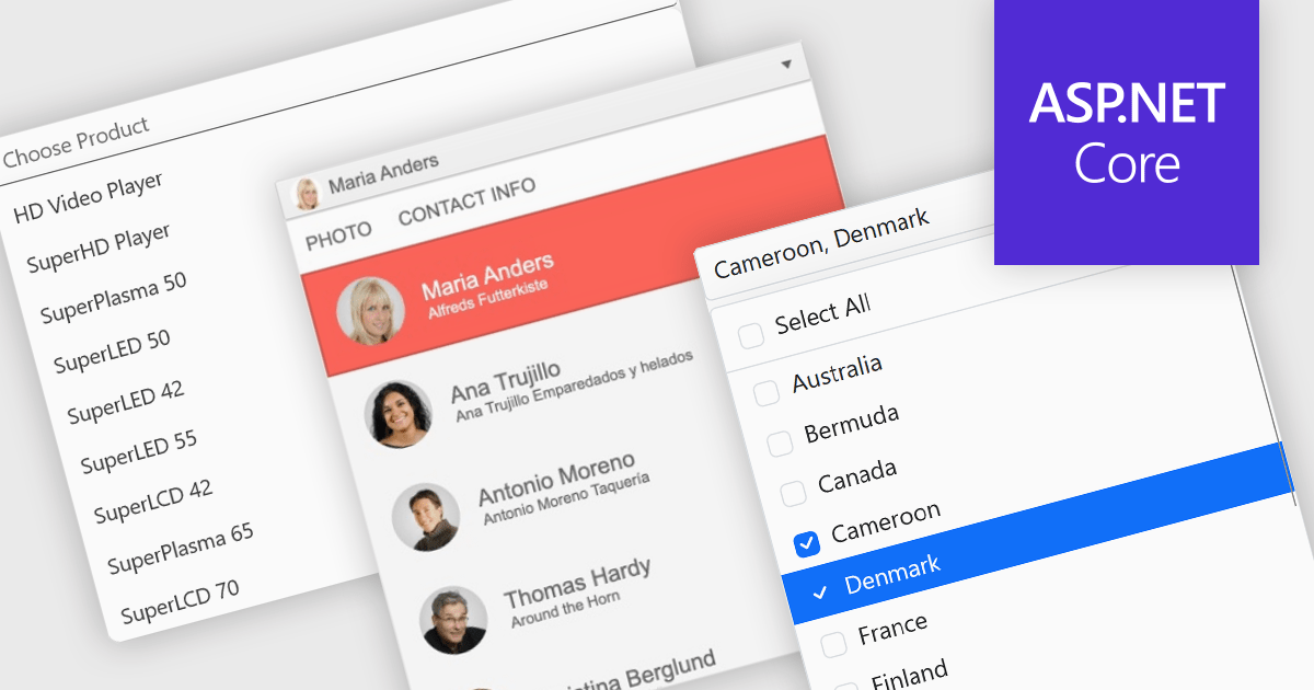
Dropdowns and lists provide structured ways for users to select and manage values within grids, forms, or tables. By constraining input to predefined options, these controls help maintain data consistency, reduce entry errors, and improve overall usability. They are commonly used in business applications where accuracy and efficiency are important, such as configuration panels, data management tools, and enterprise systems.
Common features include:
For an in-depth analysis of features and price, visit our ASP.NET Core data editor components comparison.
전화 : 00798 14 800 6332
팩스 : +1 770 250 6199


