Nevron Gauge for SharePoint
풍부한 게이지와 KPI 시각화로 SharePoint 대시보드를 구축하세요.
- SharePoint 대시보드와 보고서에 게이지 기반 데이터 시각화를 추가합니다.
- 방사형, 선형, 숫자형 게이지 레이아웃으로 KPI를 표시합니다.
- 세부 스타일링, 표시기, 범위, 여러 게이지 영역을 지원합니다.

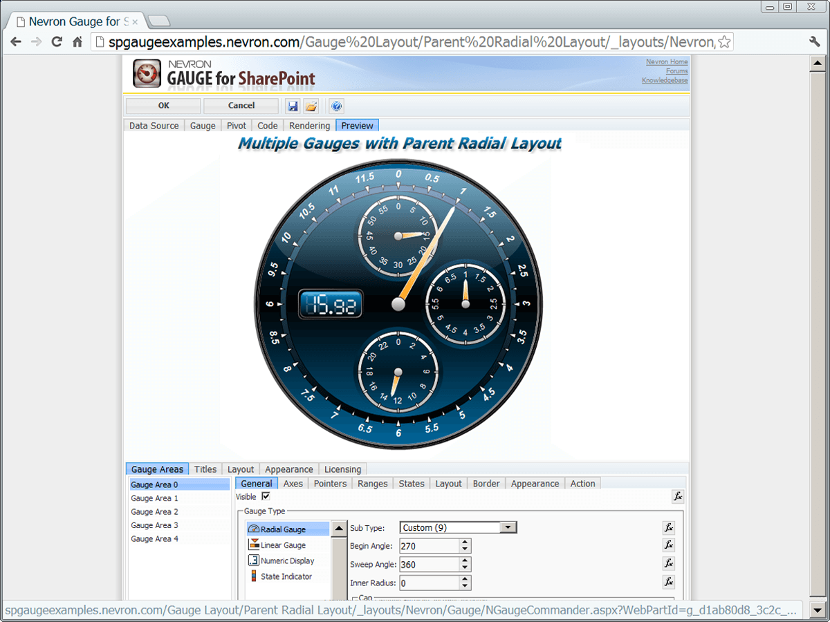
Nevron Gauge for SharePoint는 대시보드, 스코어카드, 보고서 및 KPI 표시를 위해 SharePoint 사이트에 고급 게이지 시각화를 추가합니다. 여러 게이지 스타일, 풍부한 레이아웃 옵션, 광범위한 외형 사용자 지정을 지원하여 팀이 값, 범위 및 상태를 명확한 시각 형식으로 प्रस्तुत할 수 있도록 돕습니다.
Gauge Web Part for SharePoint
This product provides a gauge web part for SharePoint that brings data visualization into dashboards, scorecards, and reporting pages. It is designed to present key values and status information in a visual format that is easy to read directly within the SharePoint environment.
Radial, Linear, and Numeric Displays
It supports several gauge presentation types, including radial gauges, linear gauges, and numeric displays. This gives teams flexibility when choosing how to represent measurements, thresholds, and current values across different reporting scenarios and page layouts.
Multiple Gauge Areas
The component can display multiple gauge areas in a single visualization. Each area can use its own gauge type, which makes it suitable for combining several related indicators in one compact dashboard element without losing clarity.
Multiple Axes and Indicators
It supports multiple axes and indicators within the same gauge. This allows users to compare related values, display different scales, or highlight several measurements at once, which is useful for operational monitoring and KPI-oriented dashboards.
Range and State Visualization
The product can visualize ranges and states directly on the gauge surface. This helps communicate whether a value falls within expected, warning, or critical thresholds, giving SharePoint users immediate visual context when reviewing live or reported data.
Custom Layout and Positioning
It includes flexible layout and positioning options for gauge elements. Users can arrange axes, indicators, and sub-gauges to fit the available page space and create displays that match the structure and emphasis of a specific dashboard or report.
Visual Styling and Appearance Control
The gauge web part offers extensive control over appearance, including gauge shapes, borders, labels, pointers, and decorative elements. This allows organizations to create visualizations that align with the style of their SharePoint pages and reporting standards.
KPI and Scorecard Presentation
It is well suited for KPI and scorecard scenarios where performance metrics must be shown clearly. By combining values, indicators, and threshold ranges, the component helps present business or technical status information in a focused visual format.
Dashboard and Reporting Integration
The product is built for use in SharePoint dashboards and reporting solutions, where gauges serve as visual summaries of important metrics. It supports the creation of pages that combine data presentation with at-a-glance monitoring for business and IT teams.
Clear Monitoring of Critical Data
It helps teams monitor critical data through gauges that emphasize current values, trends in relation to ranges, and notable status conditions. This visual approach makes it easier to spot changes, exceptions, or areas that need attention inside SharePoint-based views.
제품 호환성
아래의 세부 정보를 확인하여 이 제품이 사용 환경에서 지원되는지 확인하세요.
컴포넌트 유형
- .NET
.NET 버전
- .NET 4.8 or earlier
.NET 플랫폼
- Web Part
Nevron에 대해
Nevron은 1998년에 설립되었으며 불가리아 소피아에 본사를 두고 있는 기업으로, 소프트웨어 개발자를 위한 고급 데이터 시각화 및 사용자 인터페이스 컴포넌트를 전문으로 합니다. 풍부한 차트, 다이어그램, UI 프레임워크 제품군으로 잘 알려져 있으며, 비즈니스 인텔리전스, 과학, 엔터프라이즈 애플리케이션 분야에 걸친 폭넓은 고객층에 서비스를 제공합니다. 이 회사의 컴포넌트는 .NET 및 웹 애플리케이션과 같은 플랫폼과 개발 환경 전반에 통합될 수 있도록 설계되었으며, 광범위한 사용자 지정 기능과 뛰어난 성능을 제공합니다. 개발자들은 성숙한 기술력과 정교하고 상호작용적인 시각화에 대한 집중을 이유로 Nevron을 선택하며, 이는 복잡한 데이터 분석과 핵심 비즈니스 시스템에서의 명확한 표현을 지원합니다.