공식 공급 업체
200 이상의 소프트웨어 개발처와 판매 계약을 맺은 공인 디스트리뷰터로서 합법적인 라이선스를 제공합니다.
모든 브랜드 보기.

스크린샷: You can progressively change Alpha levels in UltraGrid. ... 더 읽기 본 제품에 관한 더 많은 결과 보기
스크린샷: UltraGrid lets you create several different column styles including: Edit, EditButton, CheckBox, Dropdown, Dropdownlist, Calendar and HTML. ... 더 읽기
스크린샷: Use ScheduleX to create Outlook-like applications. With calendar, schedules and task functionality. ... 더 읽기

스크린샷: ActiveListBar can be oriented in one of two ways. By default, the control is oriented vertically. Groups slide up and down, and list items are ordered from top to bottom. The control can also be oriented horizontally. Groups in a horizontal control slide ... 더 읽기 본 제품에 관한 더 많은 결과 보기
스크린샷: In addition to supporting multiple colors in the background, the ActiveListBar also features support for pictures in the background of groups. You can specify a simple texture or a complex design to serve as the background area for an ActiveListBar group. ... 더 읽기
스크린샷: A mask color is a color used in your image that you designate to be the transparent color. Any pixels in the image that use the mask color will allow the background to show through the image. ... 더 읽기

스크린샷: You can mask input of any column in the DataGrid or the Data Combo controls. The data masking features of Data Widgets 3 are comparable to the data masking provided by the Masked Edit Control, which is included with Visual Basic®. ... 더 읽기 본 제품에 관한 더 많은 결과 보기
스크린샷: Data Widgets features new data exporting capabilities. You can choose to export the data in your grid to an plain text file or to an HTML file. ... 더 읽기
스크린샷: The Data DropDown control is a grid that can be linked to the cells in the DataGrid (SSDBGrid) for use as a value selection list. You can display as few or as many fields in the dropdown list as you want. ... 더 읽기

스크린샷: You can dynamically resize and reposition your controls, including fonts, without writing a single line of code. ... 더 읽기 본 제품에 관한 더 많은 결과 보기
스크린샷: The SSFrame control emulates the standard Frame control, which enables a graphical and functional grouping of controls. SSFrame can additionally employ a transparent background, animated picture, marquee caption, and even a background image that may be ... 더 읽기
스크린샷: Provides a scrollable virtual container for controls. ... 더 읽기

스크린샷: Gives you the ability to have a toolbar float even if the toolbar is not used on an MDI form. ... 더 읽기 본 제품에 관한 더 많은 결과 보기
스크린샷: Customize your buttons using a wide variety of options, including bevel type, size and different button states. See a preview of each state. ... 더 읽기
스크린샷: The Dockable Toolbar control lets you create floating toolbars of buttons that the user can 'dock' to the top, sides or bottom of a Multiple Document Interface (MDI) form. ... 더 읽기

스크린샷: Custom Style Properties Complete control over font, size and colors for all entities, relations and diagram attributes. Custom Tools Palette- The custom tools palette can contain only the specific objects needed by the user. Custom objects can be added to ... 더 읽기

스크린샷: The MonthView control lets you design applications that display date information in a monthly format (up to 3 months at a time). The MonthView control provides several features which allow you to customize and integrate it into your applications. It is a ... 더 읽기 본 제품에 관한 더 많은 결과 보기
스크린샷: There are many properties in the MonthView control that let you customize the display to your liking. In addition to bevels, alignment and color, the MonthView control contains special properties that help shape the control to look and feel the way you ... 더 읽기
스크린샷: The DayView control is useful for adding a daily time schedule into an application. The DayView control can display and organize tasks for a variety of applications, whether for an Executive Information System, Personal Information Management (PIM) or ... 더 읽기

스크린샷: Create applications that look and behave in a consistent manner with products like Outlook and FrontPage. ... 더 읽기 본 제품에 관한 더 많은 결과 보기
스크린샷: The Data Explorer includes built-in viewer panes for Web browsers, Microsoft Office documents, VB Forms, MFC Dialogs, extended ListViews or any ActiveX component required. ... 더 읽기
스크린샷: The Outlook Bar is an ATL component that creates a vertical bar of icon groups, each with a series of item shortcuts that can easily be linked to folder views in the Data Explorer. ... 더 읽기

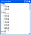
스크린샷: Supports VB dragging and dropping and OLE Drag and Drop operations. ... 더 읽기 본 제품에 관한 더 많은 결과 보기
스크린샷: The colors and fonts (where applicable) of each element of the ActiveTreeView can be adjusted individually. ... 더 읽기
스크린샷: Nodes are added to the tree in the same way that list items are added to a List control. The control stores all nodes in memory. ... 더 읽기

스크린샷: Customize the appearance of Calendar in design-time property pages Specify display preferences such as orientation of objects inside the day cell,as well as fonts, colors and images for the day cell and header. ... 더 읽기 본 제품에 관한 더 많은 결과 보기
스크린샷: Start Day Chooser Features of the DayView control are combined into an adjustable weekly display, with design-time or run-time selection of the start day. ... 더 읽기
스크린샷: ScheduleX is apartment-model threaded for optimal use in Microsoft Internet Explorer. ... 더 읽기