Actipro Micro Charts for UWP
Charts optimized for Dashboards, reports and grids.
Published by Actipro Software
Distributed by ComponentSource since 2002
Prices from: $ 116.62 Version: 22.1.x Updated: Nov 29, 2023
Charts optimized for Dashboards, reports and grids.
Published by Actipro Software
Distributed by ComponentSource since 2002
Prices from: $ 116.62 Version: 22.1.x Updated: Nov 29, 2023

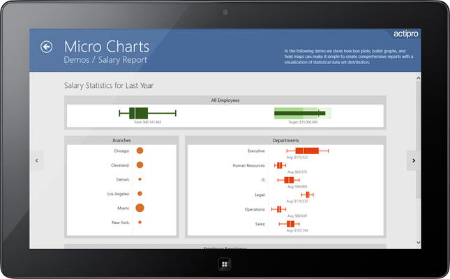
A heat map is a grid where each cell renders color and/or size differences to reflect data values. Actipro's heat map presenter control is the marker used in each heat map cell, and automatically handles the color and/or size rendering for its particular data value representation. Box plots are charts used to visualize major statistical values, such as the mean, median, and quartile values of a data set. The mean and median can be shown as bars perpendicular to the chart. The upper and lower quartile values form the edges of a box that contains the middle half of the data.


As official and authorized distributors, we supply you with legitimate licenses directly from 200+ software publishers.
See all our Brands.
Over 1,400,000 licenses delivered to Developers, SysAdmins, Corporations, Governments & Resellers, worldwide.
Read more about us.
Tel: (888) 850 9911
Fax: +1 770 250 6199
