Telerik DevCraft Ultimate
All Telerik .NET tools & Kendo UI JavaScript components in one package.
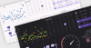
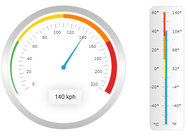
Rich Dashboards for WPF - The Executive Dashboard sample application demonstrates how you can use the WPF Gauge, Chart and ProgressBar controls to build a rich dashboard.


 (1)
(1)

 (5)
(5)
 (2)
(2)