


Fornecedor oficial
Como distribuidores oficiais e autorizados, nós fornecemos licenças legítimas diretamente de mais de 200 editores de software.
Ver todas as nossas marcas.
Continuar leitura em inglês:
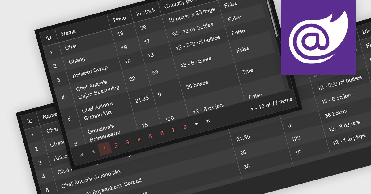
Leveraging a Blazor grid control with responsive layout empowers your application with optimal data visualization across diverse screen sizes and orientations. This enhances the user experience by ensuring seamless navigation, readability, and interaction with grid content, regardless of whether it's being accessed from a desktop computer, tablet, or mobile phone. This flexibility fosters wider accessibility, improves user engagement, and ultimately strengthens the overall value proposition of your Blazor application.
Several Blazor grid controls offer responsive layouts including:
For an in-depth analysis of features and price, visit our Blazor grid controls comparison.
Tel: (888) 850 9911
Fax: +1 770 250 6199


