Aprimore a Experiência do Usuário com Layouts Responsivos
Crie interfaces que priorizem a inclusão e a usabilidade, garantindo uma experiência consistente ao usuário com navegação perfeita em qualquer dispositivo.
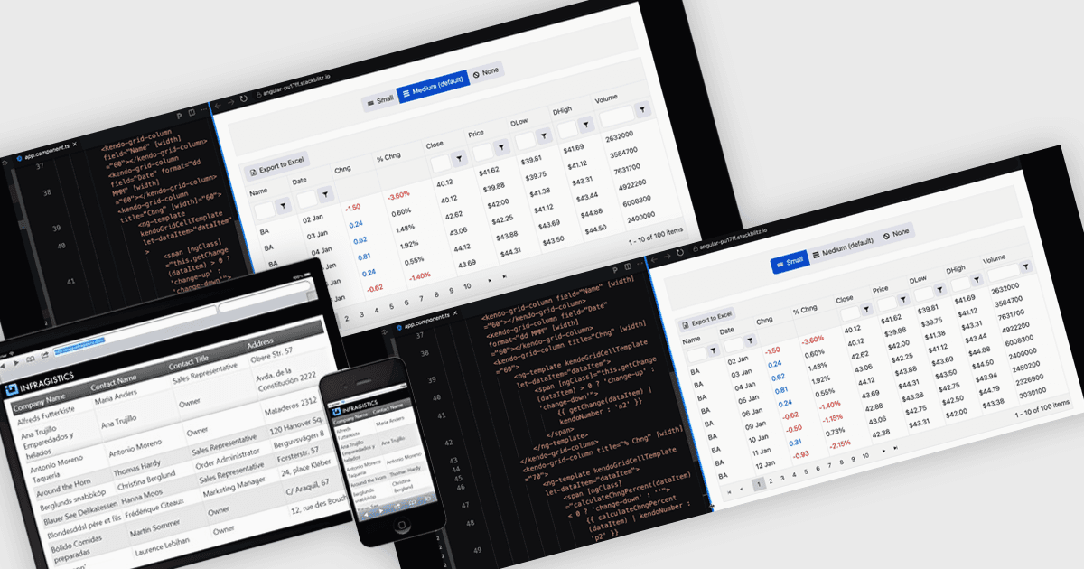
Um layout responsivo é uma abordagem de design que permite que interfaces da web e de aplicativos ajustem e otimizem automaticamente sua estrutura, conteúdo e elementos para diferentes tamanhos de tela e dispositivos. Ao usar grades flexíveis, imagens escaláveis e componentes adaptáveis, os layouts responsivos garantem uma experiência consistente e fácil de usar em desktops, tablets e dispositivos móveis. Para desenvolvedores de software, essa abordagem simplifica a criação de aplicativos multiplataforma, melhora a acessibilidade e aumenta a satisfação do usuário ao entregar interfaces que funcionam perfeitamente em ambientes diversos.
Diversos componentes de grade do Angular oferecem suporte a layouts responsivos, incluindo:
- IntegralUI Grid (parte do IntegralUI Web by Lidor Systems) permite que você crie grades de dados personalizáveis com layouts responsivos, garantindo desempenho contínuo em todos os dispositivos.
- Handsontable da Handsoncode facilita a gestão intuitiva de dados por meio de grades responsivas com aparência e lógica semelhantes ao Excel, que se adaptam dinamicamente a diferentes tamanhos de tela para máxima usabilidade.
- Kendo UI for Angular Grid (parte do Kendo UI by Telerik) capacita desenvolvedores a criar grades com processamento poderoso de dados e consistência em dispositivos e resoluções diversas.
- DevExtreme HTML5 JavaScript Data Grid (parte do DevExtreme Complete by DevExpress) possibilita apresentações de dados responsivas, combinando layouts adaptativos com edição avançada.
Para uma análise aprofundada de recursos e preço, visite nossa comparação de controles de grade do Angular.