


Fornecedor oficial
Como distribuidores oficiais e autorizados, nós fornecemos licenças legítimas diretamente de mais de 200 editores de software.
Ver todas as nossas marcas.
Continuar leitura em inglês:
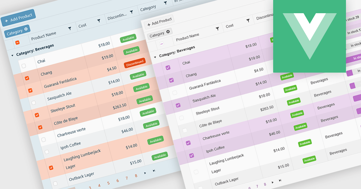
A checkbox cell type in a grid allows users to easily manage Boolean (true or false) data through a simple and visual interface. Instead of typing values manually, users can quickly toggle a checkbox to indicate states such as active or inactive, complete or incomplete, or enabled or disabled. This interaction reduces input errors and enhances data clarity, making it easy to scan and understand information at a glance. Checkbox cells improve productivity by supporting quick edits, bulk selections, and efficient filtering based on checked or unchecked values. Common use cases include task tracking, user permissions, product availability, and feature toggles where a binary choice improves workflow efficiency and usability.
Several Vue.js grid components offers checkbox cell type support, including:
For an in-depth analysis of features and price, visit our comparison of Vue.js grid components.
Tel: (888) 850 9911
Fax: +1 770 250 6199


