Official Supplier
As official and authorized distributors, we supply you with legitimate licenses directly from 200+ software publishers.
See all our Brands.
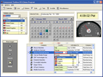
Description: choice of IDE(s) and have the functionality to meet your end-user's demands. Component Toolbox is a comprehensive, value packed collection of components including Data Edit/Input, Dialogue, Calendar, ... styles, new gradient fills, multi-column listbar, ToolBar navigation, Date/Time and Data Edits, Lists and Tree Views. Component Toolbox has 53 individual components to choose from. New, extensively ... commented component sample applications are provided to assist you in getting your job done faster. Data Edit/Input (4)- Inputting and editing data is eventually what application development is all about. Add ...
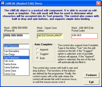
Screenshots: ctMEdit allows you to set the type of data a user enters, you can also use the Auto-Complete functionality to help speed up user input. ...
Screenshots: The ctHtml control is a window in which the user can browse sites on the World Wide Web, as well as folders in the local file system and on a network. ...

Screenshots: The ctClock control comes with its own styles for analog and digital clocks, or the programmer can override the style with a bitmap image. It continually scans the system time for the current time. ...
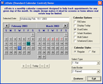
Screenshots: The ctDate control presents one or two months at a time and then allows the user to view and optionally select one of those dates. ...
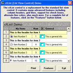
Screenshots: The ctList control can contain variable height list items, host sub-text and support multi-select and multi-lines, you can include picture clips and check boxes. ...
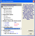
Screenshots: Use the ctTree control to display items in a hierarchical format. It is made up of a series of node objects, each node is able to contain its own text, bitmaps, check boxes and radio buttons. ...

Screenshots: Use the ctListBar to create Outlook style slider/button bars. ...
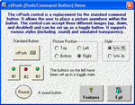
Screenshots: ctPush is an enhanced push button control. You can control the placement of text and pictures on the button, define the bevel size, use a different bitmap for up, down and disabled status and much more. ...
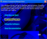
Screenshots: The ctButton control supports transparency allowing you to create hyperlink style buttons. ...
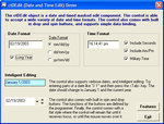
Screenshots: Use ctDEdit to format the way users enter date and time information. ...
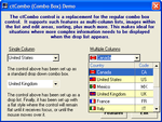
Screenshots: The ctCombo control has been enhanced to act more like the navigational drop down combo boxes found in many web browsers. It can also be used as a regular drop down combo or drop down list control. ...
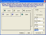
Screenshots: The ctFold control is a tabbed file folder container. ...
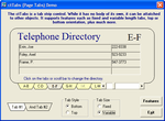
Screenshots: ctTabs is a page tab control. similar to the ctFold control except that it does not come with its own container, instead it is meant to be attached to existing controls or containers. ...
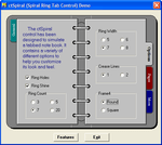
Screenshots: ctSpiral mimics the appearance of a tabbed notebook. ...
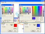
Screenshots: The ctColor object is a control used to activate the color common dialogue window. ...
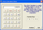
Screenshots: Add a calculator to your application with the ctCalc control. ...

Screenshots: Create Gauges with ctGauge. If a bitmap image is supplied to the control, the control will size itself to match the size of the image. ...
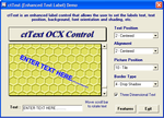
Screenshots: ctText is an enhanced text label control that allows you to display the text at any angle, with a shadowed, 3D appearance and can be conbined with a bitmap image. ...
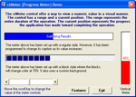
Screenshots: ctMeter can be used horizontally or vertically as a visual representation of a progress meter. ...