Treeview & List Components / Lidor Systems / jQWidgets - Best Selling
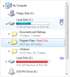
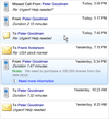
Rich data presentation controls for .NET Winforms applications.
- Includes TreeView, ListView, TreeListView and ListBox controls
- NEW - Built-in sorting and option to add custom sort operations
- NEW - Advanced formatting options by use of XML tags
Add a combination of TreeView and ListView controls to your applications.
- Includes built-in Live Editor and advanced drag&drop support
- Supports XML encoding of nodes, columns and subitems
- Highly customizable appearance and theme support (including Vista)
Add a detailed ListView to your .NET applications.
- Four views to display items: Details, Large Icon, Small Icon and List
- Includes built-in Live Editor and advanced drag&drop support
- Supports XML encoding of columns, items and subitems
Add rich hierarchical data presentation to your applications.
- Images, text and custom controls can be included in every node
- Provides fast list creation, XML encoding of node text, rich styling features, customizable appearance and theme support
Suite of 27+ advanced .NET User Interface components.
- Includes controls for docking & tabbed document management, data visualization, and grouping / organizing application layouts
- Controls have customizable appearance, multiple styles, XML load/save support
-
Release Notes:
Added support for Sparklines in jqxGrid. Added support for a Context Menu in jqxGrid. Added 'blur' method to jqxNumberInput. Added 'filterAppointments' method to jqxScheduler. Fixed an issue in jqxPopover- Popover was not closing, if a ...
Read more
Show more results from this product
-
Release Notes:
jqwidgets-ng NPM package has been updated with Server-side Rendering (SSR) support for Angular 17. 0 ...
Read more
-
Release Notes:
The jqwidgets-ng NPM package has been updated with Angular 17 support. 0 ...
Read more
-
Release Notes:
Owner Draw events for drawing each part of the control. Serialization of partial set of nodes, color schemes and themes. Show nodes with their siblings and parent nodes only. Load on Demand option for partially loading data from an XML file, database or ...
Read more
Show more results from this product
-
Release Notes:
New RatingControl can use custom images to show rating values, includes a star image as the default image. New NumberedListControl presents a numbered list of items acting like a navigation panel. New Panel and TransparentPanel controls, presents a ...
Read more
-
Release Notes:
Pixel-based scrolling enabled for ListBox, TreeListView and TreeView controls New Key property in ObjectEventArgs, used to uniquely identify different objects Fully compatible with Visual Studio 2010 The Key which specifies the text from XML content is ...
Read more
-
Release Notes:
Multi-column sorting Span subitems in multiple columns Serialization of partial set of items, color schemes and themes Load on Demand option for loading partial data from XML file, database or memory stream Owner Draw events for drawing each part of the ...
Read more
Show more results from this product
-
Release Notes:
Great performance improvement during data load and control layout update Partially visible controls remain active RightToLeft support for TreeView control New XML attributes assemblypath and resource for img tag, used to get references from embedded ...
Read more
-
Release Notes:
8 new built-in controls which can be used as a standalone and inside list controls using XML tags: CheckBox, ComboBox, DateTimePicker, ListControl, MonthCalendar, NumericUpDown, ProgressBar, TextControl Advanced filter which allows data to be filtered by ...
Read more
-
Release Notes:
Multi-column sorting. Span sub-items in multiple columns. Serialization of a partial set of items, color schemes and themes. Load on Demand option for partially loading data from an XML file, database or memory stream. Owner Draw events for drawing each ...
Read more
Show more results from this product
-
Release Notes:
Great performance improvement during data load and control layout update Partially visible controls remain active New XML attributes Option to separately show/hide the scrollbars CurrentList property, represents a flat list of all nodes that are currently ...
Read more
-
Release Notes:
8 new built-in controls which can be used as a standalone and inside list controls using XML tags: CheckBox, ComboBox, DateTimePicker, ListControl, MonthCalendar, NumericUpDown, ProgressBar, TextControl Advanced filter which allows data to be filtered by ...
Read more
-
Release Notes:
Serialization of partial set of items, color schemes and themes. Load on Demand option for partially loading data from an XML file, database or memory stream. Owner Draw events for drawing each part of the control. Different item permissions including ...
Read more
Show more results from this product
-
Release Notes:
Option to embed new control: RatingControl which can use custom images to show rating values, includes star image as default Option to fix items on top or bottom side which can act like header and footer A new constructor which accepts strings and creates ...
Read more
-
Release Notes:
Row-based and pixel-based scrolling enabled New Key property in ObjectEventArgs, used to uniquely identify different objects Fully compatible with Visual Studio 2010 The Key which specifies the text from XML content is carried with the editing events ...
Read more
-
Release Notes:
Multi-column sorting Span subitems in multiple columns Serialization of partial set of items, color schemes and themes Load on Demand option for loading partial data from XML file, database or memory stream Owner Draw events for drawing each part of the ...
Read more
Show more results from this product
-
Release Notes:
Option to show items in Card view Option to align expand box in groups Option to extend the current theme with custom colors for all controls New RatingControl which can use custom images to show rating values, includes star image as default New ...
Read more
-
Release Notes:
Great performance improvement during data load and control layout update Partially visible controls remain active New XML attributes: assemblypath and resource for img tag, used to get references from embedded resources selectedtextcolor for style tag, ...
Read more
-
Release Notes:
Added FontSize and FontStyle CSS custom properties for all components. ListBox now has built-in CheckBox for items. ListBox now has built-in RadioButton. Items can now appear as separators in ListBox. 'Add and remove' event data in List ...
Read more
Show more results from this product
-
Release Notes:
Adds animations to ListBox and TreeVIew. ListBox and TreeView Fully animated ListBox and TreeView with asynchronous animations during: Initialization. Add/Remove/Clear. Expand/Collapse. Drag Drop. Auto-Size. Moving item(s) from one position to another. ...
Read more
-
Release Notes:
Adds data validation support to Grid and TreeGrid. Added data validation support to Grid and TreeGrid with the following rules: Compare, Required, Numeric, Range, StringLength and Custom. Added the option to enable data validation for all editing modes: ...
Read more
-
Release Notes:
TabControl with nested tabs, child tabs are shown under parent tab. Expander with vertical header and horizontal expand. SplitContainer now splits content using multiple tabs. Serialization of styles for all container controls. Create groups and items ...
Read more
Show more results from this product
-
Release Notes:
Multi-column sorting Span subitems in multiple columns Serialization of partial set of items, color schemes and themes Load on Demand option for loading partial data from XML file, database or memory stream Owner Draw events for drawing each control part ...
Read more
-
Release Notes:
New controls including ExplorerBar, ListBar and OutlookBar Multiple display modes Independently expandable groups Support to embed controls Different item types including text, image, panel and separator Context menus for each group and item Each group ...
Read more


