
Telerik UI for WinForms
Create modern, supercharged Windows Forms applications in no time.
Published by Telerik
Distributed by ComponentSource since 2018
Prices from: US$ 726.53 Version: 2026 Q2 NEW Updated: May 20, 2026  (1)
(1)
Create modern, supercharged Windows Forms applications in no time.
Published by Telerik
Distributed by ComponentSource since 2018
Prices from: US$ 726.53 Version: 2026 Q2 NEW Updated: May 20, 2026 (1)
Telerik UI for WinForms is also available as part of Telerik DevCraft UI, Telerik DevCraft Complete or Telerik DevCraft Ultimate.
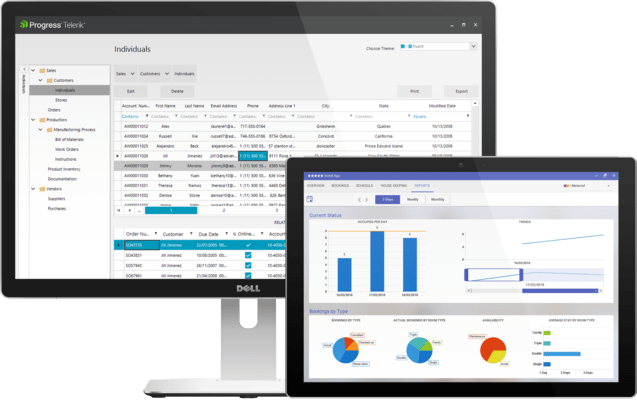
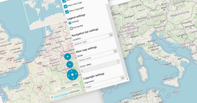
Telerik UI for for WinForms controls suite includes over 160 UI controls allowing you to quickly create distinctive and visually attractive Line of Business apps. Telerik UI for WinForms controls are ideal for Enterprise desktop development because of its well-designed architecture and CAB support.


Image 1 / 16
Telerik UI for for WinForms Key Features:
Extensive Set of Controls
Leverage 160+ WinForms UI controls and build high-performance, rich and beautiful desktop applications in half the time.
Full-featured Data Grid
Leverage Telerik UI for WinForms high-performance Data Grid including advanced filtering, grouping, sorting and 100+ more features.
Modern Professional Themes
Give your application a unique and modern look and feel with a wide range of Office, Windows and Visual Studio Inspired themes...


Telerik UI for WinForms is also available in:
Live Chat with our Telerik licensing specialists now.


 Netherlands, Theover 2 years ago
Really the best toolset for any .NET application on any platform. Well thought about and everything you need is there.
Tel: (888) 850 9911
Fax: +1 770 250 6199


 (1)
(1)