Telerik DevCraft UI
Sleek UI and tools for .NET and JavaScript technologies.
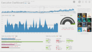
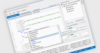
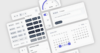
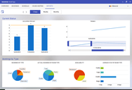
60+ ASP.NET Core Components - Telerik DevCraft UI includes a wide array of ASP.NET contols including data management, data visualization, interactivity, geo visualization, editors, layout and navigation.


 (1)
(1)
 (2)
(2)