
XtraGrid .NET Suite
Present your data, your way.
Published by DevExpress
Distributed by ComponentSource since 2001
Present your data, your way.
Published by DevExpress
Distributed by ComponentSource since 2001

New licenses of XtraGrid (Xtra Grid) can only be purchased as part of DevExpress DXperience, DevExpress Universal or DevExpress WinForms
If you require information, please visit the pages above or Contact Us for pricing and availability.
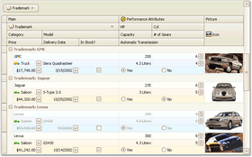
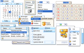
XtraGrid (Xtra Grid) includes patent-pending server side data processing and is a feature-complete editing and data shaping component allowing your end-users to easily manage information and display it on-screen. Whether using it in bound, unbound or master-detail mode, you can enable many of its features including a built-in printing engine for instant ad-hoc reporting, without writing a single line of code. And with asynchronous data loading mode, your app will always remain responsive regardless of data set size or complexity. The Xtra Grid includes 7 elegant Grid View options and is incredibly efficient at displaying information and allowing your users to manipulate data on-screen. It gives you a comprehensive set of UI choices so you can deliver solutions that solve real-world business problems. The Xtra Grid delivers powerful runtime experiences including Column, Row and Preview Customizations. Easy-to-use features are built-in to the Xtra Grid so you can deliver solutions that can be customized at both design and runtime as needs dictate. It also shapes, organizes and informs with sort, group, compute - print and export options. The Xtra Grid is not just a grid, it is a high performance data shaping, data mining and reporting platform, so you can unleash the power of information and intuitively present it to your end-users.


Image 1 / 9
Fast and Elegant
With patent-pending server side grid data processing, the high performance DevExpress WinForms Data Grid is a feature-complete editing and data shaping component allowing your end-users to easily manage information and display it on-screen as business requirements dictate. Whether using the grid in bound, unbound or master-detail mode, you can enable many of its features including a built-in printing engine for instant ad-hoc reporting, without writing a single line of code...
XtraGrid .NET Suite is also available in:
Live Chat with our DevExpress licensing specialists now.


Tel: (888) 850 9911
Fax: +1 770 250 6199


 (4)
(4)