


Fournisseur officiel
Comme nous somme les distributeurs officiels et autorisés, nous vous fournissons des licences légitimes directement à partir de 200+ éditeurs de logiciels.
Voyez toutes nos marques.
Continuer de lire en anglais:
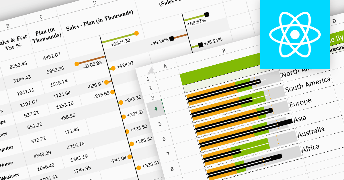
Sparklines are miniature charts embedded within the cells of a spreadsheet. Their compact size allows for dense visualizations, revealing trends and patterns in large datasets without sacrificing valuable screen space. Placed directly beside their corresponding data, they facilitate immediate comparisons and insights, enhancing understanding and communication. Their flexible nature allows for diverse chart types, from lines highlighting trends to columns showcasing comparisons, making them adaptable to various data presentations.
Here are some React spreadsheet controls that offer sparkline functionality:
For an in-depth analysis of features and price, visit our comparison of React spreadsheet controls.


Tél : (888) 850 9911
Fax : +1 770 250 6199


