
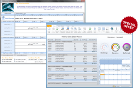
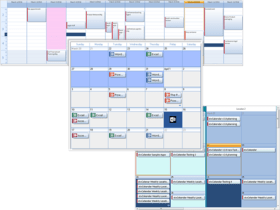
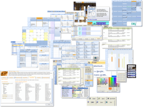
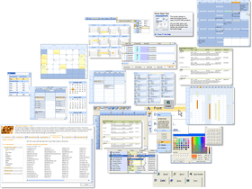
Studio Controls for COM
Software de componente para diseño y programación de interfaz de usuario de Windows moderna y contrastada para IDE basadas en COM.
Publicado por DBI Technologies
Distribuido por ComponentSource desde 2002
Precios desde: $ 979.02 Versión: v6.0 Actualizado: Jan 25, 2021 
 (3)
(3)


 (3)
(3)


