
Infragistics Ultimate UI for WPF
WPF 컨트롤이 제공하는 속도, 확장성, 터치 서포트와 함께 엔터프라이즈 개발을 마스터 하세요.
Infragistics사에서 공개
1996년 부터 ComponentSource에서 판매중
WPF 컨트롤이 제공하는 속도, 확장성, 터치 서포트와 함께 엔터프라이즈 개발을 마스터 하세요.
Infragistics사에서 공개
1996년 부터 ComponentSource에서 판매중

Infragistics Ultimate UI for WPF is the new name for Infragistics WPF and is also available as part of Infragistics Professional and Infragistics Ultimate.
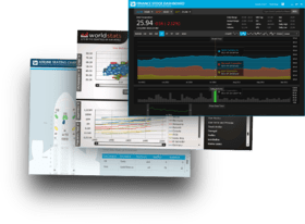
Infragistics Ultimate UI for WPF includes the time-saving controls you need with the lightning-fast, touch-friendly WPF controls. Business and financial analytics, data grids, Touch UI, Office Ribbons, OneNote-inspired radial menus, pivot grids, charts and scheduling features all combine to help you bring modern, engaging apps for desktop and touch-screen devices to market while shortening development time.


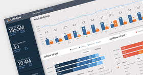
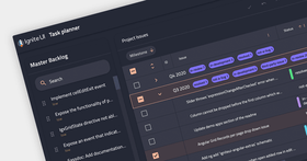
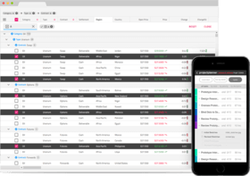
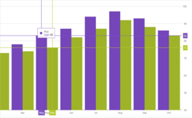
이미지 1/5
Trevor Misfeldt, CEO, CenterSpace Software
Ultimate UI Controls for WPF
Grids & Lists
Charts
Gauges
Data Entry & Display
Frameworks...

Infragistics Ultimate UI for WPF 도 구매할 수 있습니다:
Infragistics 사 제품 라이선스 담당자와 라이브 채팅


전화 : 00798 14 800 6332
팩스 : +1 770 250 6199


 (1)
(1) (1)
(1)