Actipro WPF Studio
UI controls for building beautiful desktop apps.
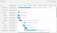
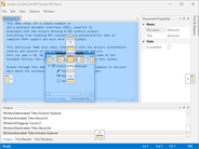
Docking & MDI for WPF - A complete docking tool window and multiple document interface solution. End users can drag and dock windows wherever they please, and persist their layout customizations. Contains docking window and MDI capabilities found in popular IDEs.


 (2)
(2)
 (5)
(5)

 (3)
(3)