Telerik DevCraft Ultimate
所有 Telerik .NET 工具和 Kendo UI JavaScript 元件集於一個軟體包中。
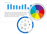
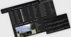
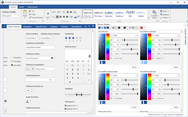
Rich Dashboards for WPF - The Executive Dashboard sample application demonstrates how you can use the WPF Gauge, Chart and ProgressBar controls to build a rich dashboard.
聯繫電話: (888) 850 9911
傳真: +1 770 250 6199


 (5)
(5)