Codejock Toolkit Pro
Provides Visual C++ MFC developers with a professional set of modern controls.
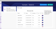
Controls - Provides Windows developers with several ready-to-use components including Buttons, Combo Box, Common Dialogs, Progress Bars, Edit Controls, Alert Popup Widows, Themed Scroll Bars, Tab Controls and more.


 (2)
(2)
 (3)
(3)

 (5)
(5)