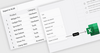
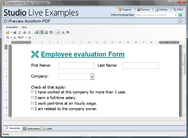
Los componentes de visualización de datos implementan la funcionalidad para ver datos en tablas o cuadrículas de datos, como tablas simples o complejos gráficos, y permiten crear sofisticados registros de gestión mediante indicadores, mapas y diagramas de flujo.
Añada gráficos y mapas interactivos a sus aplicaciones y sitios web.
Gráficos de acciones ágiles - La capacidad de respuesta de Highcharts Stock va más allá del mero ajuste del gráfico a las dimensiones de su contenedor. También encuentra automáticamente una ubicación óptima para elementos no gráficos, como leyendas y encabezados.
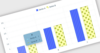
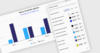
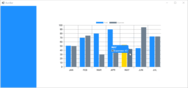
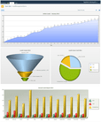
Visualización avanzada de datos para obtener informes más informativos.
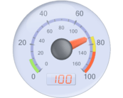
Nevron Gauge for SSRS - Aporta a sus informes conjunto completo de medidores, ejes personalizables, integración estrecha de datos y efectos visuales insuperables. Con medidores lineales, indicadores estado y visualizaciones numéricas.
Herramientas de gráficos - Se suministra con un conjunto de herramientas para agregar funcionalidad adicional, que incluye anotaciones, información sobre herramientas, cursores, puntos de arrastre, control deslizante y desplazamiento de serie. También puede personalizar paletas de colores, transparencia, degradados, sombras, fuentes de texto y más.
Una biblioteca JavaScript pura para crear gráficos ágiles e interactivos para aplicaciones React.
Depurador - El depurador de Highcharts le ayuda a acelerar el desarrollo al proporcionar advertencias instantáneas e informes de errores para sus gráficos. Los mensajes de error proporcionan instrucciones claras sobre cómo resolver el problema.
Proporciona a los desarrolladores de Visual C++ MFC un conjunto profesional de controles modernos.
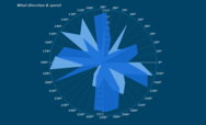
Codejock Chart Pro - Tipos de gráficos, por ejemplo, de barras, puntos, líneas, secciones, radar, polar, áreas, financiero, Gantt, embudo, pirámide, gráfica y análisis. Los gráficos son totalmente personalizables, lo que le permite crear prácticamente cualquier estilo de gráficos.
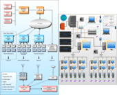
Cree organigramas simples, flexibles y altamente personalizables.
Templates - OrgChart JS includes a number of predefined templates. It also allows you to inherit from a template and override its properties to create your own custom templates to suite your needs.
Cree rápidamente aplicaciones modernas y de alto rendimiento para cualquier plataforma.
WinUI Chart - Un componente de gráficos versátil diseñado desde cero teniendo en cuenta las últimas tendencias y prácticas de Windows. Cuenta con un rico conjunto de series de gráficos que incluyen barras, líneas, áreas, circulares y financieros.
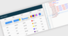
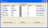
Mantenga las cuadrículas sincronizadas con datos cambiantes mediante actualizaciones dinámicas, sin que los usuarios tengan que actualizar manualmente la vista.
ComponentSource y Jspreadsheet colaboran desde hace 3 años para ayudar a los desarrolladores a crear potentes aplicaciones web basadas en hojas de cálculo.
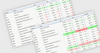
Handsontable 17.1.0 permite generar archivos XLSX directamente desde la cuadrícula conservando filtros, ordenación, disposiciones de columnas y otros ajustes de vista.


 (2)
(2)
 (2)
(2)


