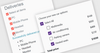
User interface and interaction components allow you to create input controls for your applications. Typical software controls include: button, toolbar, ribbon bar, list and treeview UI controls, as well as data editors and input controls.
Advanced client-side printing solution for JavaScript.
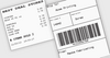
Raw Data Printing - Process raw data and/or commands supported by many client printers including: EPSON ESC/POS, HP PCL, PostScript, Zebra ZPL, Eltron EPL, and more. Shipping labels generated by postal services like UPS, FedEx, USPS, DHL as well as PRN files are also supported.
Provides Visual C++ MFC developers with a professional set of modern controls.
Command Bars - Provides Windows developers with comprehensive, fully customizable menus, toolbars, ribbon and MDI tab windows to give your application a professional and modern interface.
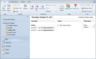
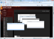
Docking & MDI for WPF - A complete docking tool window and multiple document interface solution. End users can drag and dock windows wherever they please, and persist their layout customizations. Contains docking window and MDI capabilities found in popular IDEs.
Everything you need to build modern, beautiful, responsive apps.
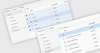
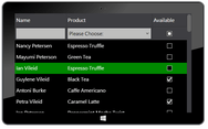
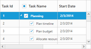
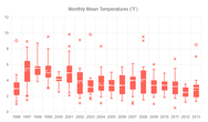
Modern UI Components - Kendo UI's 100+ components handle everything you need to satisfy your business requirements. Add advanced components such as data grids, charts, schedulers, and calendars with just a few lines of code.
Build high-performance office-inspired WPF business apps faster.
Modern, Professional Themes - Easily style the outlook of your applications to the needs of your project with one of the 20+ built-in themes, or use the Color Theme Generator.
All Telerik .NET tools & Kendo UI JavaScript components in one package.
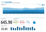
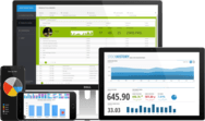
Rich Dashboards for WPF - The Executive Dashboard sample application demonstrates how you can use the WPF Gauge, Chart and ProgressBar controls to build a rich dashboard.
Sleek UI and tools for .NET and JavaScript technologies.
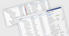
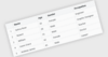
60+ ASP.NET Core Components - Telerik DevCraft UI includes a wide array of ASP.NET contols including data management, data visualization, interactivity, geo visualization, editors, layout and navigation.
Build applications for Windows, Web, mobile and tablet.
Blazor Accordion - Create advanced hierarchical navigation menus with endless element nesting. Features include: data binding support, built-in search panel, filtering, multiple expand/collapse modes and support for custom items.


 (2)
(2)
 (2)
(2)


 (2)
(2)