Screenshot Preview

ASPxGauges Suite

by DevExpress (Developer Express) - Product Type: Component / ASP.NET WebForms

Add gauges and digital dashboards to your ASP.NET applications. 
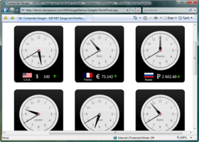
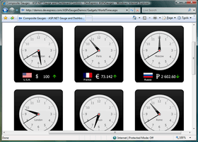
ASPxGauges Suite lets you place multiple gauges into one container and enable automatic arrangement. ASPxGauges Suite allows you to place multiple DevExpress Gauges into one container and enable automatic arrangement. ASPxGauges Suite (GaugeControl) includes State Indicator, Circular, Linear and Digital Gauges. Note that DevExpress Gauges can be freely resized while maintaining the highest level of quality, since the ASPxGauges Suite uses vector graphics for all gauge types. ASPxGauges Suite includes over 150 built-in presets and is extremely easy to use. With ASPxGauges Suite all you need to do is drop a DevExpress Gauge control onto a form. With a DevExpress Gauge you won't have to manually create elements, customize their appearance, size and layout, etc. Simply choose the template you like best and bind your control to data. ASPxGauges Suite Subscription includes the source code.

From
$78.39

Our regular prices are shown below. Please logon to see your discounted prices.

Price in

ASPxGauges Suite

Add to Cart $ 78.39 Subscription Renewal for one year (for Subscriptions soon to expire or just expired) Verify Download (29 KB)
Add to Cart $ 97.99 Subscription Renewal for one year (for Subscriptions soon to expire or just expired) - with Source code Verify Download (29 KB)

Our prices include ComponentSource technical support and, for most downloadable products, an online backup and a FREE upgrade to the new version if it is released within 30 days of your purchase.  All sales are made on our standard Terms and Conditions and subject to our Return Policy. Please contact us if you require any licensing option not listed, including volume licensing and previous versions.

Our regular prices are shown above. Please logon to see your discounted prices.

What's new in ASPxGauges Suite v2011 vol 1?

  • Custom Draw for Gauge Elements - Added a new event that allows you to manually draw gauge elements and thus fully redefine appearance.
  • Layout Enhancements - You now have a greater control over the layout of gauge elements in AutoLayout mode. You can specify padding and indent values when a gauge container automatically aligns individual gauge elements.

What's new in ASPxGauges Suite v2010 vol 2?

  • New Themes - introduced four new application wide themes including three Microsoft Office 2010-like styles.

What's new in ASPxGauges Suite v2010 vol 1?

  • Full Support for Visual Studio 2010 and .NET Framework Client Profile

Circular gauges - The Gauge Control provides built-in presets for the following circular gauge types: Full, Three Quarters, Half, Quarter and Wide.

Gauge Scales - Depending on the preset you've selected, a gauge initially contains one or two scales. If you need more scales or if you are designing a Gauge from scratch, you can manually add a scale via the gauge's smart tag. Once scales have been created, you can click them to access their settings via the Properties window. This allows you to customize the following settings.

  • Upper and lower scale limits
  • Current value (can be bound to a data field)
  • Major tick mark visibility, appearance, frequency and label text format
  • Minor tick mark visibility, appearance and frequency
  • Scale dimensions and position

Additional Elements - The following elements are available for current value indicators.

  • Needles.
  • Markers.
  • Range bars (require an anchor value to be specified so that one end points to this value, while the other end points to the bound scale's current value).
  • You can further enhance your gauge by adding the following elements:
  • Freely-arranged text labels
  • Spindle caps
  • Embedded state indicator gauges

Linear Gauges - The Gauge Control provides built-in presets for horizontal and vertical Linear Gauges.

Gauge Scales - Depending on the preset you've selected, a gauge initially contains one or two scales. If you need more scales or if you are designing a Gauge from scratch, you can manually add a scale via the gauge's smart tag. Once scales have been created, you can click them to access their settings via the Properties window. This allows you to customize the following settings.

  • Upper and lower scale limits
  • Current value (can be bound to a data field)
  • Major tick mark visibility, appearance, frequency and label text format
  • Minor tick mark visibility, appearance and frequency
  • Scale dimenstions and position

Additional Elements - The following elements are available for current value indicators.

  • Level bars.
  • Markers.
  • Range bars (require an anchor value to be specified so that one end points to this value, while the other end points to the bound scale's current value).
  • You can further enhance your gauge by adding the following elements:
  • Freely-arranged text labels
  • Embedded state indicator gauges

Digital Gauges - The Gauge Control provides four types of digital gauges: seven-segment, fourteen-segment, 5x8 matrix and 8x14 matrix. All digital gauge types ship with multiple themes.

DevExpress Digital Gauge controls provides the following digital gauge settings:

  • The number of characters to be displayed
  • Character spacing
  • Customizable appearance for enabled and disabled segments
  • Data field used to supply display text (in data-bound mode)

State Indicator Gauges - The following are just a few examples of state indicator gauges shipped with the Gauge Control.

  • Process state indicators (e.g. traffic lights gauge).
  • Value level indicators (e.g. smiley gauge).
  • Clipart, allowing you to enhance your application usability by incorporating explanatory images (e.g. state flags or currency symbol gauges).

The main benefit of using State Indicator Gauges is that the DevExpress Gauge controls use vector graphics so that images will preserve their quality regardless of their current size which in turn saves you the trouble of adjusting images to the required control size or vice versa - adjusting controls so that they fit images. Once you start using DevExpress Gauges, you will never again worry about resizing issues when using resizable containers - state indicators are automatically resized with their parent control.


Product Search

Enter search words:

Award Award