
Telerik UI for WPF
Build beautiful and high-performance WPF business applications fast.
Published by Telerik
Distributed by ComponentSource since 2018
Prices from: $ 734.02 Version: 2026 Q2 NEW Updated: May 20, 2026
Build beautiful and high-performance WPF business applications fast.
Published by Telerik
Distributed by ComponentSource since 2018
Prices from: $ 734.02 Version: 2026 Q2 NEW Updated: May 20, 2026

Telerik UI for WPF is also available as part of Telerik DevCraft UI, Telerik DevCraft Complete or Telerik DevCraft Ultimate.
Telerik UI for WPF is a commercial toolkit for creating next-generation line of business and kiosk applications using Windows Presentation Foundation. Telerik UI for WPF controls provide a high-performance, visually appealing, and highly customizable shortcut to the world of engaging user experiences, leveraging the platform's incredible potential as well as many years of excellence in presentation layer technology.


Image 1 / 22
Telerik UI for WPF Key Features:
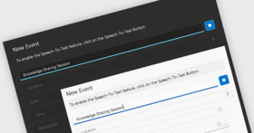
Extensive Set of Controls
Leverage a complete suite of WPF UI controls and build high-performance, rich and beautiful desktop applications in half the time.
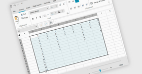
Full-featured Data Grid
Leverage Telerik UI for WPF high-performance Data Grid including advanced filtering, grouping, sorting and 100+ more features.
Modern Professional Themes
Give your application a unique and modern look and feel with a wide range of Office, Windows and Visual Studio Inspired themes...


Telerik UI for WPF is also available in:
Live Chat with our Telerik licensing specialists now.


Tel: (888) 850 9911
Fax: +1 770 250 6199


