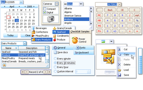
Screenshot Preview

XtraEditors Library - Summary

by DevExpress (Developer Express) - Product Type: Component / .NET WinForms / .NET Class / 100% Managed Code

Summary

XtraEditors Library by DevExpress (Developer Express)

URLs: xtraeditors-net, xtraeditors net, xtraeditorsnet, devexpress

Build rich user interfaces for your .NET applications without writing a single line of code. The XtraEditors Library is a 100% C# based component suite designed and optimized for Visual Studio .NET and all .NET languages. XtraEditors Library (devexpress.xtraeditors) includes 15 data edit controls. Every editor in devexpress.xtraeditors is available in both unbound and data-aware mode. With built-in Windows XP Theme support, XtraEditors Library will easily enable the newest look and feel standards in your next .NET application. Like all Developer Express .NET controls, you can also purchase the full C# source code for XtraEditors Library.

The XtraEditors Library gives you 20 feature-complete editors and 2 custom editor samples which demonstrate how easy it is to create your own editors. All the editors can be used in bound and unbound modes. All of them can be used as standalone or within container controls such as the XtraGrid, XtraTreeList, XtraVerticalGrid and XtraBars. The XtraEditors Library in addition gives you 16 controls from panels and group boxes, to tab control, data navigator and list boxes. This ensures that you build consistent applications whatever your business needs are.

The XtraEditors Library includes the following editors that can be used in bound or unbound mode, standalone or within containers like the XtraGrid, XtraTreeList, XtraVerticalGrid, XtraBars:

CheckEdit - a multi-purpose control that can serve either as a check box with two or three states or as a radio button

ProgressBarControl - a progress bar

MarqueeProgressBar - an infinite progress bar control

RadioGroup - an automatically arranged radio button group

PictureEdit - a control that allows pictures to be displayed and edited, by pasting them from the clipboard or loading them from a file

TextEdit - a single-line text editor that implements the basic text editing features used by other controls which have a text box

MemoEdit - a multi-line text editor

ButtonEdit - a text editor that allows you to display any number of buttons on the left or right edge of a text box

HyperLinkEdit - a text editor that provides a hyperlink appearance to the text and allows hyperlinks to be invoked

SpinEdit - provides easy editing of numeric values by incrementing or decrementing edit values using spin buttons, the mouse wheel or keyboard

TimeEdit - allows you to increment / decrement the currently selected time value element (hours, minutes, seconds) using spin buttons, the mouse wheel or keyboard

ComboBoxEdit - allows text values to be edited by selecting an item from the dropdown list or typing in values directly. It provides advanced features such as auto-completion of entered values

ImageComboBoxEdit - a combo box with a separate edit value and display text. Allowing you to display images within the text box and dropdown items

MRUEdit - a combo box that adds all the most recently entered values into the dropdown list

LookUpEdit - a multi-column combo box with lookup functionality. It offers you a number of advanced features such as dropdown list sorting, incremental filtering, etc.

DateEdit - a date editor with a dropdown calendar

PopupContainerEdit - allows you to display any control within the dropdown window.

CalcEdit - provides a dropdown calculator for easy editing of numeric values

ColorEdit - an editor with a Visual Studio-like color picker dropdown

MemoExEdit - a control with a dropdown memo editor. The best choice for providing memo fields in grids if you don't want to corrupt the layout of the cells

ImageEdit - a control with a dropdown picture editor. The best choice to present image fields in grids if you don't want to corrupt the layout of the cells

TrackBar - a track bar control

RangeTrackBar - a track bar control allowing you to set two values

ZoomTrackBarControl - Office 2007 style track bar control

Font Edit - font selector control

The following additional controls are included.

FilterControl - a stand-alone emulation of the XtraGrid's built-in Filter Editor which allows end-users to construct filter criteria of any complexity

XtraTabControl - a feature-complete tab control

DataNavigator, ControlNavigator - these controls have a common interface but differ in functionality. The first is bound to a data source to provide navigation through records, addition, deletion, etc. The second can be bound to controls that implement a specially designed interface. The XtraGrid control, for instance, implements this interface to provide master-detail navigation

ListBoxControl, ImageListBoxControl, CheckedListBoxControl - three variants of the list box control

LabelControl - a label that can display a horizontal divider after the text

SimpleButton - a button control that can display an image along with text

PanelControl - a panel control

GroupControl - a group box whose caption can be repositioned

SplitterControl - a splitter control

SplitContainerControl - a control represented by two group boxes which are separated by a vertical or horizontal splitter

HScrollBar, VScrollBar - scroll bars

XtraScrollableControl - allows you to easily implement custom scrollable controls

XtraForm, XtraUserControl, XtraMessageBox - controls designed to bring complete consistency to the user interface throughout the entire application

Appearance Customization

All the controls can be painted in 3D, Flat, UltraFlat, Office 2003 style or using the currently applied XP theme

Included controls fully support the Skins technology which means elements are constructed from a set of bitmaps. This allows you to provide an XP look and feel for any operating system. With the XtraEditors, you get multiple built-in skins including Office 2007 skins

The previous two benefits are possible since the XtraEditors Library supports a shared painting library. With this library, you have centralized control over the look and feel of all controls. You can change the paint style of all the controls by changing just a single property

The main benefits brought to you by the editor controls:

Masked input capabilities. You have numerous mask specification alternatives. From specifying masks as format strings to fully functional regular expressions with branching and auto-completion functionality

Formatting display values using standard format strings, custom format strings or by implementing a custom formatter class

Advanced data validation and error indication mechanisms

The ability to enter and indicate null values

Custom parsing for entered text

If you build data entry forms with the XtraEditors Library, end users can move focus to the next control in the tab order using the ENTER key

Full support for the keyboard and mouse wheel

What's new in XtraEditors Library v2011 vol 1?

XtraTabControl - Support for Custom Buttons - You now have the ability to display custom buttons within the WinForms Tab Control. In addition to default buttons (Close, Next, and Prev), you can display a custom button with any display text or image (or both), and provide the appropriate tooltip when required.

HyperLink - The WinForms HyperLink Control allows you to launch a link either by clicking a point within the edit box or only the text itself.

What's new in XtraEditors Library v2010 vol 2?

New Filter Editor - Edit Filter Criteria in Text and Tree-Like Form - Shipping as part of the Rich Text Editor library (XtraRichEdit), the new Filter Editor control has been designed to provide you with extended filter editing capabilities. It is a hybrid of the current Filter Control (Tree-like data filter) and a text-based filter editor.

What's new in XtraEditors Library v2010 vol 1?

Full Support for Visual Studio 2010 and .NET Framework Client Profile

What's New in XtraEditors Library v2009 vol 3?

Automatic Editor Type Switching - With this release, all DevExpress WinForms Editor controls used on a form can be converted to another editor using the dropdown available through the control's smart tag. This procedure automatically preserves the control's size and location so as not to break form layout and copies all common settings and event handlers - freeing you from any manual modifications.

What's New in XtraEditors Library v2009 vol 2?

Rich Text Editors in Grid Cells - Previously the XtraRichEdit engine could be used only to display rich text content within data-aware control cells. In addition to read-only mode, you can now use the same repository item to edit HTML, RTF, Plain Text, MHT and DOCX data stored in your data fields.

Animated Icons in Tab Page Headers and Labels - You can now assign animated GIF images to page headers and labels and their animations will be displayed correctly.

Incremental Searching in ListBox Controls -Your end-users can now search for information more effectively within the ListBox Controls.

Customizable Menu Contents in Filter Controls - You can now customize the content of all menus used within Filter Controls. This allows you to remove unnecessary columns or operations from built-in menus. In addition to menu customization, you can also handle newly implemented events to customize data editors on the fly.

What's New in XtraEditors Library v2009 vol 1?

Auto-Collapsing Panels - You can now enable the auto-collapsing feature in the SplitContainerControl. With this feature, an end-user can click the splitter to minimize one panel, and thus maximize another.

Prompt Text in Empty Editors - You can now easily enable input prompt text for editors with blank values. This text immediately disappears when the editor gets focus.

Advanced Tooltips for Tab Control's Pages - The tab control now supports SuperToolTips so that you can display rich information about tab pages, including images and memo fields.

Custom Text Representations of Check Box Values - If a grid column or tree list column contains Boolean values, you can use CheckEdit controls for data visualization. When grouping data against these column, displaying their filter dropdown list and in some other instances, true and false values are represented by "Unchecked" and "Checked" strings. You can manually specify the strings that should be displayed instead of true and false.

What's New in XtraEditors Library v2008?

New Component - CheckedComboBoxEdit - This new control allows you to display a set of Boolean options or bit fields in a dropdown window. It can be used both standalone and for in-place editing within container controls (XtraGrid, XtraTreeList, etc).

What's New in XtraEditors Library v2007 vol. 2?

New Components - The XtraEditors Library introduces two new button controls and a new component that makes it easier to validate user input.

DropDownButton - This button can be associated with a popup control or a context menu. End-users can invoke the associated control by clicking the button's drop-down arrow

CheckButton

DXValidationProvider - Previously, in order to validate data within standalone editors, you had to manually subscribe to Validation events and invoke custom validation code. The DXValidationProvider component looks at the validation task from a different standpoint. With this component, you don't need to write code. Simply create validation rules and associate them with editors.

Embeddable MarqueeProgressBar Сontrol - In previous versions, MarqueeProgressBar could only be used as a standalone control. With this release, it can be integrated into toolbars, ribbons, grids and all other Developer Express container controls.

Animation - The PictureEdit and ImageEdit controls now support animated GIF files. GIF animation support is also available within container controls (such as the XtraGrid, XtraTreeList, XtraBars, etc). As an example, the following image shows how you can enhance a grid control's functionality using animated GIF files:

Displaying RTF Data in Container Controls - Container controls (such as the XtraGrid, XtraTreeList, XtraVerticalGrid, etc) can now display RTF data within their cells (read-only mode). This allows you to show formatted text with images without using any custom draw features.

What's New in XtraEditors Library v2007 vol. 2?

ZoomTrackBarControl - The new ZoomTrackBarControl component enables you to imitate the track bar used in Microsoft Office® 2007. This track bar allows users to scale documents and is usually displayed within the status bar's right section. If you own the XtraBars Suite, you can implement the same interface, since editors from the XtraEditors Library can be embedded into our toolbar, menu, Ribbon and status bar components

FontEdit - Another new editor is the font selection combo box. This control provides the same appearance and behavior as the font selector in Microsoft Office®. Just like the ZoomTrackBarControl, the new FontEdit can be embedded into our container controls, including grids, toolbars and ribbons

Vista Style Clock in Date Editor's Dropdown - The DateEdit control now allows end-users to manipulate the time portion of the edit value. The editor's dropdown window displays a Windows Vista style clock and a TimeEdit control

Re-designed List Box Controls - In v2007 vol. 2 the following controls have been redesigned from the XtraEditors Library: ListBoxControl, ImageListBoxControl and CheckListBoxControl

Build rich user interfaces for your .NET applications without writing a single line of code.

Pricing: XtraEditors Library Subscription Renewal for one year (for Subscriptions soon to expire or just expired), XtraEditors Library Subscription Renewal for one year (for Subscriptions soon to expire or just expired) - with Source code

Evals & Downloads: Read the Developer Express License Agreement - Requires Acrobat Reader, Read the XtraEditors Library help file, Download the DXperience v2011 vol 2 (V11.2.11) evaluation on to your computer - Expires After 30 Days

Operating System for Deployment: Windows 7, Windows Vista, Windows XP, Windows ME, Windows 2000, Windows NT 4.0

Architecture of Product: 32Bit

Product Type: Component

Component Type: .NET WinForms, .NET Class, 100% Managed Code

Compatible Containers: Microsoft Visual Studio 2010, Microsoft Visual Studio 2008, Microsoft Visual Studio 2005, Microsoft Visual Basic 2010, Microsoft Visual Basic 2008, Microsoft Visual Basic 2005, Microsoft Visual C++ 2010, Microsoft Visual C++ 2008, Microsoft Visual C++ 2005, Microsoft Visual C# 2010, Microsoft Visual C# 2008, Microsoft Visual C# 2005, .NET Framework 4.0, .NET Framework 3.5, .NET Framework 3.0, .NET Framework 2.0

Product Class: User Interface Components

Keywords: xtraeditors, devexpress.xtraeditors, devexpress lookupedit, devexpress textedit, devexpress dateedit, devexpress comboboxedit, devexpress editors,devexpress buttonedit, xtraeditors library, xtra editors, xtraeditors library, subscription with source, xtraeditors subscription, xtraeditors library subscription

devexpress, developer express, dxperience, devexpress.com, devexpress controls, devexpress download, www.devexpress.com, devexpress dxperience, devexpress suite, devexpress components, devexpress tools, devexpress universal, devexpress upgrade

User Interface UI

Entry data-entry

validation validate

Part numbers: PC-512164-379236 512164-379236 PC-512164-379238 512164-379238

Product Search

Enter search words:

Award Award