Llegue a más usuarios con diseños de gráficos accesibles
Los gráficos de alto contraste mejoran la accesibilidad, reforzando la comprensión y la inclusividad en informes, paneles y presentaciones.
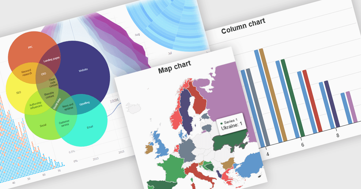
Los gráficos de alto contraste utilizan paletas de colores distintas y contrastadas dentro de las visualizaciones de datos para mejorar la claridad, especialmente para las personas con discapacidades visuales. Esto implica elegir colores con matices y brillo claramente diferentes para elementos como líneas, barras, etiquetas y fondos, de modo que las diferencias en los datos sean fáciles de detectar. Estos gráficos mejoran la comprensión de los datos, hacen la información accesible para más personas, reducen la fatiga visual para algunos usuarios y respaldan los estándares de accesibilidad. Son útiles en muchas áreas, como informes financieros, artículos científicos y paneles de salud pública que deben ser claros y estar diseñados para que todos, independientemente de su capacidad visual.
Varios componentes de gráficos de JavaScript ofrecen funciones de alto contraste accesibles, como:
- JSCharting renderiza gráficos de alto contraste accesibles, mejorando la claridad de los datos y la inclusividad para usuarios con discapacidades visuales en diversas aplicaciones.
- SmartClient Chart de Isomorphic Software ofrece temas de alto contraste integrados, asegurando que las personas con discapacidad visual puedan interpretar eficazmente datos empresariales complejos.
- jQWidgets Chart permite la creación de visualizaciones de datos de alto contraste, mejorando la comprensión y la accesibilidad para un público más amplio en aplicaciones web.
- Highcharts Core de Highsoft facilita la implementación de gráficos de alto contraste personalizables, promoviendo la inclusividad en la representación de datos para todos los usuarios.
Para un análisis en profundidad de funciones y precio, visite nuestra comparación de componentes de gráficos de JavaScript.